First off I'm not going to regurgitate what the art history books say.
My first encounter with Diane Arbus' images was in 1982 on the back cover of a 12" EP by the Sex Gang Children. They were an art school post punk band producing a strange collection of gothic type apocalyptic rantings (typical student stuff). At the time I didn't know whose photos were on the cover as there is no reference on the sleeve. I assumed that they were taken for the cover to underpin the shock value and mystery around the band. Almost 30 years later and Arbus' images still facinate me whilst, I have to say, the Sex Gang Children's 'Beast' EP hasn't survived so well!
The exhibition at Tate Modern takes over 3 rooms and includes 'a box of ten photographs', a group of ten photographs selected and printed by Arbus as her definative portfolio during her lifetime. Diane Arbus is known for taking pictures of people on the periphery of society, from circus people to inmates in mental hospitals and nudest camps and had a committment 'to photograph everybody'.
Arbus is generally thought of as sympathetic towards her subjects but this is not a view shared by all. Germaine Greer's experience of being photographed by Arbus is less complimentary (http://www.guardian.co.uk/artanddesign/2005/oct/08/photography). Most of Arbus' portraits do not appear to over dramatise the subject. For me, she doesn't try to make people look like freaks but nor does she make any attempt to take them in a flattering way. The people themselves are the interest, not the situations they are put in and quite often unsettling in their own right. The context in which the subjects are put is usually quite subtle. Perhaps an exception to this is the 'boy with a toy hand grenade' who is in a very deliberate pose. I always been a fan of this picture and it was in fact one of the images used on the EP I mentioned earlier. However, I have only recently seen the contact sheet below that shows some alternative shots taken at the time. These show the boy in a completely different light, from a confused angry child from a broken home to a boy without a care enjoying a day in the park with the rest of the family, demonstrating how a photographer can control the emotions and thoughts of the viewer. Interestingly, the final image is the only one showing the boy in this light.
The following pictures are both in the collection at the Tate and are typical subjects for Arbus (if you can call any of them a typical subject).
Teenage couple on Hudson Street NYC 1963. This image shows a young couple that frankly look old before their time. There is no reference point for scale in the picture but both of them look rather petite. They are both smartly dressed but the shot is taken on what looks like a run down backstreet with litter and doors that open on to the street. Does this point to where they live or just where she met them? A subtle background but one that sets the tone for the image.
Boy with a straw hat, NYC 1967. Clearly taken outside an offical building of some kind, this boy looks indocrinated to the point where he even looks like he was dressed by someone else. Slightly awkward looking and not sure what to do next. For me, this underpins a scary view of the American way of life.
Jose Navarro has just blogged about rephotography and I have recently been to Bradford National Media Museum to see (amongst others) Daniel Meadows' early works which included updated portraits of people taken in his earlier career. Interestingly I have just found this image from Feb 2011, so quite recent, of the twins from 'Identical Twins, Roselle, New Jersey, 1967' which is one of Arbus' most famous works. They don't remember the day they entered photographic history but they still have the dresses (which are green). Their parents tried to stop republication of the image. I do ask myself sometimes when I look at photos such as Arbus' 'what what happened to these people?'. I'd like to know what became of the boy with the hand grenade.
The exhibition shows a wide range of Arbus' work even including a self portrait taken early on when she was pregnant. I have usually draw a picture in my head of what a photographer looks like when I look at their work so it's always interesting to see what they really look like.
I have been to a large number of exhibitions this past year but this was one of the exhibitions I was most looking forward to and it did not disappoint. Arbus had an eye for capturing people on the edge of society and a unique way of capturing them.
Friday, 28 October 2011
Wednesday, 19 October 2011
Light: Project - Photographic lighting - concentrating light
Exercise: concentrating light
Aim: The aim of this exercise is to create a shot that uses concentrated lighting and also to construct a snoot as a method of concentrating that light.
Approach and results:
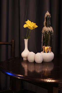
I wanted to create a simple still life for this shot. I had been framing some prints so I decided to use this as the inspiration. The pencil, cutter and scissors were all orange and this strong orange presence was ideal for highlighting with a concentrated light source.
I created the snoot from a cardboard tube. In the first instance this was too defined. It created a definate circle of light over the subject with an obvious edge. I wanted a softer edge so I taped a piece of tissue over the end. This was too soft and diffuse, evening up the scene. I then went from 2 ply to 1 ply and this gave me the result I was looking for.
I lit the subject from fairly high up aiming down at a slight angle. I chose this to keep any obvious and unwanted shadows to a minimum. Using a reflector to remove shadows would have spread the light across the scene. I like the way the light tails off towards the background, giving a hint of the finished framed print leaning against the wall.
Learning points:
When concentrating the light the subject needs to be central unless there is a particular reason to deliberately offset the light, otherwise it just looks careless. It took a number of attempts to get this shot, slightly repositioning the light each time.
Snoots can create harsh edges so it is useful having something to diffuse the light slightly.
Concentrating the light can emphasize and focus on any element of the shot and can produce very dramatic or moody images. This shot would look completely different without the concentrated lighting. The lighting has emphasized the composition.
Tuesday, 18 October 2011
Light: Project - Available light
Exercise: outdoors at night.
Aim: The aim of this exercise is to explore the variety of lighting effects and colour in artificial light.
Approach and results:
For this exercise I had a number of places and buildings in mind. Setting up the camera for the different types of shot was important. Despite being all night shots, the desired results needed particular settings. Tripod mounted shots did not need a high ISO whereas handheld and long focal length invariably did unless it was very bright. I used centre or spot metering for specific subjects like buildings and evaluative for the more general shots where the whole scene was important. A camera does not recognise when you want atmosphere so it was necessary to compensate for some of the overly bright images in order to get the end result.
I tried a number of times to get an indoor shot of a large space with lots of people but this restricts you to shopping centres and the security was rather sharp. I'll try again sometime with a smaller camera.
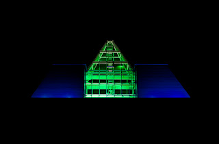
This first shot is of the top of a local office building called the pyramid. I wanted to isolate the building from it's surroundings so I waited for a clear night with no cloud cover or light pollution. I used tungsten WB to keep the colours cool. The green especially would turn more yellow with daylight balance.
The following two identical shots of the Pantheon in Paris show the difference between black & white and colour. The black & white has much more even tones as there is no difference in the lighting whereas the colour shot shows the yellow from the street lamps lighting the lower part of the building, the white floodlight lighting the roof and dome and the blue/white light of the moon. I like the colour contrast of the artificial lighting against the moonlight which is lost in the B&W shot.
The main aim for this next shot was to ensure I exposed for the lights and not the building. Neon lights like these are easily overexposed. Because of the close crop there was enough light to hand hold at a reasonably low ISO.
This shot is of Vidal Sasson after it closed (I didn't want any people in it). I took it because of the arrangement of the bottles in the window. It reminds me of a Damien Hurst installation that I saw many years ago that was the interior of a chemist shop with lots of white bottles lined up; an almost clinical quality. The lights are quite dim as some of the shop lighting had been turned off so I had to use a high ISO. I also used tungsten balanced WB to keep things as white as possible.
This shot was split toned (red/green) in Photoshop. There was already a significant difference between the foreground and the background so I used the split tone to accentuate this. The red table and chairs were lit by a bright red outdoor heater.
For this shot I wanted to keep a large area of darkness. The metering on the camera always wanted to brighten the whole scene up so I used exposure compensation. I originally took this in black and white but I like the colour as much; the darkness leading into the light and the stairs taking the viewer up to the restaurant sign.
One issue with night lighting is flare but in the right place it can be very effective. In this shot the flare from the streetlamps makes them look like a pair of drop earings. Again there is a lot of black in this picture but this was necessary to stop the clock face from blowing out. I could have increased the dynamic range or used photoshop to bring out the rest of the picture but I prefer the mood the darkness creates.
These next two shots are long exposures taken from a motorway bridge. I took a range of shots from different positions and at different shutter speeds. Over 10 seconds gave continuous streaks of light but it's dependant on the speed of the traffic. Motorways are obvious choices for this kind of shot but I think city centre night shots are far more interesting.
The following two shots show the difference between a one sec and a 10 sec exposure taken from a moving car. I tripod mounted the camera on the passenger seat and used a cable release to take the shots. The dashboard was never going to stay sharp with the long exposures but I wanted it in the shot as it gives more of an idea of the exposure and lets the viewer know that it is the camera that is moving. The ten second shot was taken on the motorway. I enjoyed creating these shots as there was an unexpected element. I stopped every now and then to check what I'd got and adjust the camera settings. I got a lot of interesting shots of which these are only two. Driving past a zebra crossing is interesting; have you noticed that the poles on belisha beacons light up these days?
These final two shots were taken under the floodlit conditions of the greyhound stadium. Despite being bright, I still used a higher ISO because of the focal length of both shots. The first shot was taken across the track and the second was taken from the grandstand through glass. There are no refections because they dim the lights when a race is underway.
Learning points:
Night photography is very wide ranging with quite different techniques needed for different shots; moving and static subjects, dim or brightly lit and different colour temperatures.
When it came to white balance I would quite often use what I prefered for mood rather than accuracy. The photographer creates the image and this is just another weapon in the photographers arsenal. Daylight balance was invariably too warm but there are a wealth of different types of artificial lighting these days and more and more of them have a more natural balance. The AWB on my new camera is far more accurate than on my old camera and I found that I could rely on it far more.
Cameras are far better at dealing with high ISOs these days and I found I could shoot most scenes handheld unless deliberate streaks were the desired outcome. If noise becomes an issue then shooting in B&W and presenting it as grain is also an option.
Aim: The aim of this exercise is to explore the variety of lighting effects and colour in artificial light.
Approach and results:
For this exercise I had a number of places and buildings in mind. Setting up the camera for the different types of shot was important. Despite being all night shots, the desired results needed particular settings. Tripod mounted shots did not need a high ISO whereas handheld and long focal length invariably did unless it was very bright. I used centre or spot metering for specific subjects like buildings and evaluative for the more general shots where the whole scene was important. A camera does not recognise when you want atmosphere so it was necessary to compensate for some of the overly bright images in order to get the end result.
I tried a number of times to get an indoor shot of a large space with lots of people but this restricts you to shopping centres and the security was rather sharp. I'll try again sometime with a smaller camera.
This first shot is of the top of a local office building called the pyramid. I wanted to isolate the building from it's surroundings so I waited for a clear night with no cloud cover or light pollution. I used tungsten WB to keep the colours cool. The green especially would turn more yellow with daylight balance.
I sec ISO200 tripod |
I/8 sec ISO800 handheld |
I/125 sec ISO400 handheld |
I/50 sec ISO1600 handheld |
I/30 sec ISO400 handheld |
I/45 sec ISO800 handheld |
I/45 sec ISO200 handheld |
13 secs ISO200 tripod |
I0 secs ISO200 tripod |
I sec ISO200 tripod |
I0 sec ISO200 tripod |
I/80 sec ISO800 handheld |
I/100 sec ISO800 handheld |
Night photography is very wide ranging with quite different techniques needed for different shots; moving and static subjects, dim or brightly lit and different colour temperatures.
When it came to white balance I would quite often use what I prefered for mood rather than accuracy. The photographer creates the image and this is just another weapon in the photographers arsenal. Daylight balance was invariably too warm but there are a wealth of different types of artificial lighting these days and more and more of them have a more natural balance. The AWB on my new camera is far more accurate than on my old camera and I found that I could rely on it far more.
Cameras are far better at dealing with high ISOs these days and I found I could shoot most scenes handheld unless deliberate streaks were the desired outcome. If noise becomes an issue then shooting in B&W and presenting it as grain is also an option.
Monday, 17 October 2011
Light: Project - Available light - tungsten and fluorescent lighting
Exercise: tungsten and fluorescent lighting
Aim: The aim of this exercise is to compare the different qualities and limitations of tungsten and fluorescent lighting.
Approach and results:
Part 1 - Tungsten. The first part of this exercise involves taking a series of meter readings to see how bright the conditions are under tungsten lighting. I used the living room at dusk and using the evaluative metering at ISO200 I recorded 1/125sec near the light source and 2" in the darkest corner. Taking this further I used the spot meter on the light bulb to get 1/1250 and in the darkest part of the darkest corner I got 8". Using the spot meter showed the extremes but is not very useful, however I was curious! What it does highlight is that the light is much weaker than daylight.
I then set up a still life shot that had tungsten light and fading daylight in the shot and took three exposures. The first uses Auto WB, the second tungsten balanced and the third is daylight balanced. The first two shots are similar whilst the third shot is much cooler. Te auto white balance has obviously chosen a tungsten value, which probably means that this was the more dominant light source. The daylight balanced shot shows how much cooler tungsten light is compared to daylight.
Part 2 - For this part of the exercise I needed two different interiors lit by flourescent lamps. I chose a shopping centre and a theatre cafe as my two venues. The aim was to take the same scene with auto and flourescent WB settings and compare the outcome.
The first two images were taken in the shopping centre on a small pocket camera (as photos are not permitted). The first shot is the auto WB and the second is the flourescent. The auto setting handled the situation better than the flourescent setting which surprises me. There is a pink cast on the second shot. I think the main issue is finding somewhere that is purely flourescent lighting. There was a mixture of artificial lighting here, and in all the other places I visited. The different shops, the cafe I was in and the shopping centre itself have different lighting.
The next three shots were taken in the theatre cafe on an SLR. The first shot is the auto WB and the next two are different flourescent sttings. A different camera and a different setting but similar results. I prefer the auto WB result. Again there was a mixture of lighting and also possibly some daylight.
Learning points;
Artificial light is generally much weaker than daylight.
Internal scenes often have a mixture of light that needs to be balanced. Quite often a WB setting on a camera will be too specific, for example flourescent or tungsten.
In tricky scenes I usually use the manual kelvin scale to 'dial in' an accurate temperature.
Aim: The aim of this exercise is to compare the different qualities and limitations of tungsten and fluorescent lighting.
Approach and results:
Part 1 - Tungsten. The first part of this exercise involves taking a series of meter readings to see how bright the conditions are under tungsten lighting. I used the living room at dusk and using the evaluative metering at ISO200 I recorded 1/125sec near the light source and 2" in the darkest corner. Taking this further I used the spot meter on the light bulb to get 1/1250 and in the darkest part of the darkest corner I got 8". Using the spot meter showed the extremes but is not very useful, however I was curious! What it does highlight is that the light is much weaker than daylight.
I then set up a still life shot that had tungsten light and fading daylight in the shot and took three exposures. The first uses Auto WB, the second tungsten balanced and the third is daylight balanced. The first two shots are similar whilst the third shot is much cooler. Te auto white balance has obviously chosen a tungsten value, which probably means that this was the more dominant light source. The daylight balanced shot shows how much cooler tungsten light is compared to daylight.
Auto WB |
Tungsten WB |
Daylight WB |
Part 2 - For this part of the exercise I needed two different interiors lit by flourescent lamps. I chose a shopping centre and a theatre cafe as my two venues. The aim was to take the same scene with auto and flourescent WB settings and compare the outcome.
The first two images were taken in the shopping centre on a small pocket camera (as photos are not permitted). The first shot is the auto WB and the second is the flourescent. The auto setting handled the situation better than the flourescent setting which surprises me. There is a pink cast on the second shot. I think the main issue is finding somewhere that is purely flourescent lighting. There was a mixture of artificial lighting here, and in all the other places I visited. The different shops, the cafe I was in and the shopping centre itself have different lighting.
Auto white balance |
Flourescent white balance |
The next three shots were taken in the theatre cafe on an SLR. The first shot is the auto WB and the next two are different flourescent sttings. A different camera and a different setting but similar results. I prefer the auto WB result. Again there was a mixture of lighting and also possibly some daylight.
Auto white balance |
Flourescent white balance |
Learning points;
Artificial light is generally much weaker than daylight.
Internal scenes often have a mixture of light that needs to be balanced. Quite often a WB setting on a camera will be too specific, for example flourescent or tungsten.
In tricky scenes I usually use the manual kelvin scale to 'dial in' an accurate temperature.
Wednesday, 12 October 2011
Light: Project - The time of day - variety with low sun
Exercise: variety with low sun.
Aim: The aim of this exercise is to demonstrate the advantages and options when shooting in low sun.
Approach and results: After waiting for a clear afternoon/evening I chose a couple of local spots that would provide me with the views that I wanted; those being front, side, back and rim lighting situations.
Frontal lighting - The following shot was taken into the sun (not directly). I chose the fountain so that the sun would highlight the water droplets. The rest of the fountain is a silhouette. The shutter speed was always going to be fast because of the strong sunlight which meant that the water droplets would be frozen. I liked the way that the sun has picked up all the individual droplets, including the spray at the bottom and also the way the strong sunlight has penetrated the leaves in the foreground making them light up. I was also attracted by the way that the shape of the fountain has guided the growth of the plants in the main bowl, falling like a curtain with the water following suit.
F6.3 1/500sec ISO200 |
Side lighting - This shot of a converted mill was lit from the side. I chose to crop out anything other than the building and used a 70-200 lens, compressing the perspective. The crop creates a pattern of light and dark shapes and lines and the low sun gives a real glow to the red brick mill. One thing to be aware of for this type of shot is the amount of light and shade and the effect this has on the cameras metering. I used manual for this shot as in composing the shot the light was up and down and the meter continually changed the exposure.
F4 1/1000sec ISO200 |
Back lighting - This shot was taken with the sun behind, casting long shadows from the trees and the goal posts. I took the shot slightly to one side to avoid my own shadow. The length of the goal post shadow is about 5 times the size of the posts. The large shadow is a tree some 50m away. I chose to shoot at an angle so that all lines would converge in the corner.
F5.6 1/500sec ISO200 |
Rim lighting - A heavy rain shower and strong sun has caused the water to evaporate creating mist which shows the direction of the light hitting the tree from the back right side creating a lit edge down the side of the tree trunk. It can be necessary to under expose for rim lighting to ensure that the effect is captured and not washed out.
F5.6 1/60sec ISO200 |
Learning points:
Rim lighting was the most difficult to capture. I found other examples such as railings, but the one thing in common was that they were all round. Also it wasn't just the subject but the background as well. The rim lighting did not show up against a bright background.
I like all these shots for a similar reason; they all create quite a dramatic or striking image no matter which angle the light is from. They all have high contrast and strong shadows of one form or another.
Late or low sun provides far more opportunities for a dramatic image. It also has a warmth that is not available any other time of day.
Monday, 3 October 2011
Light: Project - The time of day
Exercise: Light through the day
Aim: The aim of this exercise is to compare the effects of light on the same scene throughout the day. The conditions needed to be consistantly sunny.
Approach and results:
It took me a long time to find the place I wanted. I had a number of places in mind that I visited but were not suitable. I wanted a view that would have uninterupted light across the whole scene. I also wanted to be facing north so that the sun would go from right to left and at no point would I have the sun aiming directly at the camera. The most open place I found was Manchester airport but it was just too far to travel to get pictures on the hour or on different days (as the weather was not consistant). I'll bear it in mind for other exercises. Another venue was a local park with a high viewpoint but because the trees are in leaf there is no clear view at this time of year. The final place is also a park with a fairly mixed view including trees and buildings and has a wide and clear view north. Another thing that attracted me was the self storage sign that is upside down. I'm presuming it was put up facing the other way to advertise to the motorway traffic just behind and has fallen backwards? By the time I finished the exercise it was up the right way. I took shots more frequently at the start and end of the day as this was when the scene changed most rapidly. 15 minutes could make a hugh difference at either end of the day.
Points to note:
There are a lot of changes going on in this series of images. Running through the pictures quickly like a flicker book made me more aware of the subtle changes that were going on! In particular the shadows falling on the trees that I had missed.
The early morning light is quite hazy and weak and although sunny, the shadows are not at all distinct. The scene really comes alive from about 7:45 when the sun becomes stronger and reaches the football pitch. Before this the scene is much darker and cooler. The early sun warms up the image which then cools down mid morning until late afternoon when it warms up again.
The red brick warehouse has a section that juts out creating a shadow that starts long on one side, slowly shrinks and the lengthens the other side throughout the day. Also the red brick warms up later in the day.
The industrial units in the front left have corrugated roofs that become more promenent as the day goes on. The shadows become clearer from about 4:00 onwards.
The front of B&Q is bright white early on but starts to look grey from about 12:00 onwards.
The goods warehouse on the horizon looks most dramatic early on. The shadows even out and the blue doors become a visible part of the image at 1:00.
Long shadows fall over the football pitch later on making the picture considerably darker in the foreground.
There are a considerable number of changes that go on in any particular scene during the course of the day. Although you assume you know this, actually doing this exercise makes you appreciate the extent of the changes. When you see a spectacular landscape image you can understand the time and effort invested by the photographer and hours spent at the scene just to identify the right moment. This can make the difference between a good shot and a great shot.
Aim: The aim of this exercise is to compare the effects of light on the same scene throughout the day. The conditions needed to be consistantly sunny.
Approach and results:
It took me a long time to find the place I wanted. I had a number of places in mind that I visited but were not suitable. I wanted a view that would have uninterupted light across the whole scene. I also wanted to be facing north so that the sun would go from right to left and at no point would I have the sun aiming directly at the camera. The most open place I found was Manchester airport but it was just too far to travel to get pictures on the hour or on different days (as the weather was not consistant). I'll bear it in mind for other exercises. Another venue was a local park with a high viewpoint but because the trees are in leaf there is no clear view at this time of year. The final place is also a park with a fairly mixed view including trees and buildings and has a wide and clear view north. Another thing that attracted me was the self storage sign that is upside down. I'm presuming it was put up facing the other way to advertise to the motorway traffic just behind and has fallen backwards? By the time I finished the exercise it was up the right way. I took shots more frequently at the start and end of the day as this was when the scene changed most rapidly. 15 minutes could make a hugh difference at either end of the day.
Points to note:
There are a lot of changes going on in this series of images. Running through the pictures quickly like a flicker book made me more aware of the subtle changes that were going on! In particular the shadows falling on the trees that I had missed.
The early morning light is quite hazy and weak and although sunny, the shadows are not at all distinct. The scene really comes alive from about 7:45 when the sun becomes stronger and reaches the football pitch. Before this the scene is much darker and cooler. The early sun warms up the image which then cools down mid morning until late afternoon when it warms up again.
The red brick warehouse has a section that juts out creating a shadow that starts long on one side, slowly shrinks and the lengthens the other side throughout the day. Also the red brick warms up later in the day.
The industrial units in the front left have corrugated roofs that become more promenent as the day goes on. The shadows become clearer from about 4:00 onwards.
The front of B&Q is bright white early on but starts to look grey from about 12:00 onwards.
The goods warehouse on the horizon looks most dramatic early on. The shadows even out and the blue doors become a visible part of the image at 1:00.
Long shadows fall over the football pitch later on making the picture considerably darker in the foreground.
6.45 |
7.00 |
7.15 |
7.30 |
7.45 |
8.00 |
8.30 |
9.00 |
10.00 |
11.00 |
12.00 |
13.00 |
14.00 |
15.00 |
16.00 |
17.00 |
17.30 |
17.45 |
18.00 |
18.15 |
18.30 |
Learning points:There are a considerable number of changes that go on in any particular scene during the course of the day. Although you assume you know this, actually doing this exercise makes you appreciate the extent of the changes. When you see a spectacular landscape image you can understand the time and effort invested by the photographer and hours spent at the scene just to identify the right moment. This can make the difference between a good shot and a great shot.
Subscribe to:
Posts (Atom)