Wednesday, 7 September 2011

Light: Project - The colour of light

Exercise: judging colour temperature 1

Aim:  the aim of this exercise is to understand the effects of colour temperature and white balance at different times of the day.

Approach and results:

I chose to shoot three pictures of my partner whilst on holiday.  One in full sun at midday, one in shade at midday and one as the sun was dropping in the late afternoon.  The camera's white balance was set to sunny.  As this is a direct comparison I haven't done any post processing.  At the time my thoughts were that the midday sun was neutral but harsh, the shade was neutral but softer and more even and the late afternoon sun was warmer but not overly warm.

This first image is the sun at midday and is fairly accurate if a little cool.  You can see by the shadows that the sun was almost directly overhead producing a very harsh, unflatering light.  The second image is midday shade and the image is definately cooler or bluer than it should be.  The sunny WB has overcompensated in the shade.  The late afternoon image is not overly warm.  I think taking the shot later still would change this.  The colours look warm but the skin tone does not.  The defocussed lavendar in the background is certainly warmer than earlier in the day (the main reason we were there).


Midday sun

Midday shade

late afternoon sun
 Learning points:

If you chose to control the white balance it is necessary to change it to suit the scene and not, for example,  just leave it on sunny on a sunny day.  It is important to know what you camera will do at certain WB settings.  I don't think I was aware that the sunny WB would cool down the shadey image quite so much.

If you use AWB it is important to get to know what your camera will do.  My experience with my camera is that if left to it's own devices in shadier situations the images can be on the cool side.  Particularly in woodland or tree shade.  In tricky situations I will use the kelvin scale and the live view to adjust the WB.

Tuesday, 6 September 2011

Light: Project - The intensity of light

Exercise: Higher and lower sensitivity

Aim:  The aim of this exercise is to investigate the difference in using a range of ISOs and the trade off between being able to take a shot and the noise levels in the image.

Approach and results:

I started by using ISO 100 in as lower light as possible to the point where I was relying on the image stabilisation for some of the shots and on close inspection there was still some movement.  The images only really became pin sharp at ISO 800.  I took the same shot using ISO 100 to ISO 3200.  In reducing the images for the blog any close-up comparison is impossible as there is no longer enough detail to compare.  Therefore I have sampled some of the areas in the images.

For the first example I chose an image with a range of colours and have enlarged ISO400 and ISO3200.  ISO400 shows no noise in any areas.  800 was slightly sharper but there were some speckles creaping in under close inspection.  1600 was noisier still and 3200 was the worst.  It was most noticable in the soft, out of focus areas.  The grey or midtone areas also show more noise.  Blacks were handled quite well which is surprising.  Any large plain area had a tendency to highlight noise.  That said, even the 3200 when viewed normally was far better than I expected and probably usable to a reasonable size.  I would have thought this would be limited to small web images but this exercise has changed my mind. 

Original

ISO 400


ISO 3200

For the second example I have enlarged ISO100 and ISO800.  As this is a close up shot I needed a small aperture to get the required depth of field.  The result is that ISO100 is not fast enough to keep the image sharp.  ISO800 is a far better result and a more usable image with very little if any noticable noise introduced.


Original

ISO 800 (top) and ISO 100 (bottom)

I also tried the multi frame noise reduction option on my camera which works at all ISOs and takes a series of images to reduce noise.  This worked very well and is a useful tool for low light static images.

Learning points:

I don't need to be too worried about using higher ISOs and I can be much more flexible with the ISO range that I use rather than generally leaving it on 200 and using maximum apertures.
In scenes with large plain areas it is worth using as low ISO as you can as this is where it becomes most obvious.
A slight amount of noise will always be preferential to a blurred image.
This does not make me want to use auto ISO as I still want to know what ISO is being used.

Light: Project - The intensity of light

Exercise: Measuring Exposure

Aim:  This exercise is in two parts.  Part one is a series of shots that are deliberately lighter or darker than average with a description why.  Part two is series of 5 shots but for each shot there are 5 exposures based around the average to see whether lighter or darker exposures are more accurate or provide a better image.

Approach and results:

Part 1:  The first thing to note here is that the shots that are deliberately dark have small but bright points of interest that do not look good shrunk for the blog.  The following three images are all darker than usual because I wanted the particular bright areas to be the interest in the picture.  In the first picture it was the shaft of light round the end of the arch and the sunlit leaves that caught my eye.  I took a series of pictures to get to this result.  The first picture gave an even exposure bringing all the detail out in the foreground and walls but blowing out the sunlit areas.  At this point I set the camera to manual, set the aperture I wanted for the depth of field and then altered the shutter speed until I got the result I wanted.
For the shot of the church window I took a spot reading from the window as the average exposure lost all detail in the stained glass (which was the reason for the picture).  I then set the exposure in the same way as I did for the first picture.  I approached the shot of the stairs in the same way.

F7.1 1/125sec ISO200

F7.1 1/100sec ISO200

F5.6 1/200sec ISO200
The next two images are lighter than average.  This first image had dark shadows and a lack of detail in the window, lemon and chillies.  I took a different approach to getting the exposure I wanted by using the cameras exposure compensation and pushing the exposure by 0.7 stops.  I did this in aperture priority so the camera did not alter the depth of field.  This brought back the detail I wanted whilst only lightening the brickwork by a small amount.  I have no idea why a lemon and some chillies were nailed to a wall in a Manchester back street!!
For the second shot of the vine I took a spot reading off the grapes as the first exposure made them too dark with very little detail.  The background is now bright but surprisingly acceptable as it is not the focus of the picture.

F8 1/30sec ISO200

F4.5 1/160sec ISO200
Part 2: For this part of the exercise I took 5 seperate pictures but bracketed the exposures one stop either side in half stop increments.  The aim is to see what acceptable tolerances there are around the average exposure.  Bracketing is something that I used to do a lot with film as you were never sure of the result.  Using digital this is not something I do as much anymore.  I used the evaluative metering for all the images.  The results depend on two things; how the camera metered the scene and what I wanted in the image in the first place.

Using the first shot of the stained glass window, half a stop over brings out more green in the image, the white remains bright, the writing in the middle is clear and the blacks are still black.  One stop over makes the writing blown out by the white background.  Under exposing makes the white start to look grey and more of the green turns almost black.

The second shot of the bins is tolerable half a stop either side but not any further.  One stop over washes out the colour in the bins and one stop under loses the red bins in the background.

The third shot of the backstreet is interesting as I think all the results are ok depending on what you are looking for.  The overexposed shots bring out the detail in the dark backstreet without overexposing any particular area giving it an almost filmset appearance.  The underexposed shots create a darker,more realistic but more mysterious image reminiscant of the large areas of black in a Bill Brandt type image and would probably look good in black and white.   

The most obvious use for bracketing is in the 4th image where the sky and ground are 50/50 making the average less predictable.  In this case the under exposed shots are preferable as the detail in the tree and sky is not lost.

The fifth image suffers as a result of the sun going in and out so the average shot is brighter than the others.  As you under expose the detail in the sky comes out more but this is not the main focus of the picture and therefore does not work.


Learning points:

There are a number of ways to get the exposure you want including using the right metering method, bracketing, using the cameras exposure compensation or using manual mode.
I was surprised to see how many of the over/under exposed images were actually ok in my eye.
If the subject is correctly exposed there is more tollerance for areas of the picture that are too dark or too light.
Images with less extremes of light and dark are more tollerant to over or underexposer.

Technology has moved on.  I can expand the dynamic range in camera which also has built in HDR but these functions should be used with caution.  Extremes of light and dark can be an important part of the image the photographer wants to create and evening things out can be detrimental as it changes the focus of the picture and can reduce the dramatic impact.


Tuesday, 26 July 2011

Les rencontres D'Arles photographie 2011

I've just got back from the South of France where I spent a day at 'Les rencontres D'Arles photographie 2011' (Arles photography festival). There were 47 exhibitions across the town so we were scratching the surface a bit!

One of the key themes was the future of photography. 'From here on' was an exhibition of work from 36 photographers under the following manifesto:


The curators of the exhibition and also authors of the manifesto are; Clement Cheroux, Joan Fontcuberta, Erik kessels, Martin Parr and Joachim Schmid.

The majority of the exhibits were constructed from 'found' photos from the internet (Google images/maps, Flickr etc.). There were collections of globes, suns, TVs, swimming pools, baseball grounds and so on which I have to say I found rather repetitive as a theme! Is yet another collection of poor quality photos of 'stuff' based around a theme taken off the internet really the future of photography? The need for a considerable number of images also makes them less descerning. Penelope Umbrico's 8,799,661 suns from Flickr is an example. This is a wall of 6x4s of images of the sun from different Flickr sites. I would doubt that these were hand picked in any descerning way (because they weren't that good). They are also someone else's pictures.

My overall impression was that it was more a fascination with the internet than photography. You may say I'm missing the point but I can appreciate what has been done and I am a fan of patterns and collections. Jenny Odell's collections of images from Google satellite images are interesting and visually striking but it's just that it is getting repeditive already - where next? This appears to be an attempt to make photographers relevant in the world of social networking by collecting images that show trends in human nature 'turning old into new and elevating the banal'.

A different take on this was Corrine Vionnet's 'Photo Opportunities' which is a collection of images of famous landmarks culled from the internet and layered over each other giving a painterly result and demonstrating that we all take similar 'photographic trophies' on holiday.

What I enjoyed most......

New York Times Magazine - The venue for this was the church in the main square which lends itself very well to the exhibition. It has a series of alcoves that were used to display different collections of images. Copies of the relevant issues were also on display along with storyboards giving you an idea of how a particular piece was created and developed from an idea to the final copy. My favorite's were Gregory Crewsden's 'Dream House' and portraits by Inez van Lamsweerde and Vinoodh Matadin. 'Dream House' is a series of images of celebrities, their faces fairly expressionless like manikins, in a suburban environment. The surreal situations and lighting are like images from a dream. The Inez van Lamsweerde and Vinoodh Matadin portraits included Clint Eastwood in a vale of smoke making him look like a cloud that had come to life. This description doesn't do it justice!

Maya Goded 'Welcome to Lipstick'. This depicts the life of prostitutes in a neighbourhood called Lipstick on the Mexican border. The slide show captures the misery, fear and hopelessness of surviving in this lawless environment. The images show a dark dirty and sinister place that raised the hairs on the back of my neck. The pictures on the website do not do this justice but here's the link - http://mayagoded.com/mg/

Fernando Montiel Klint 'Acts of Faith' and 'Nirvana'. These colourful saturated images were all based around a central character often the main subject of the lighting. The images are strong, complicated unatural images that grabbed my imagination. Because of their complexity there is a delay in the images that made me look at them for a long time, seeing more and more the longer I looked. The photos were large (1.2x1.4m in general) allowing you to see the detail that you can't really see on the website. This made them all the more dramatic to me. His use of colour and light created images that I found myself getting lost in. http://www.fernandomontielklint.com/

Yann Gross 'Horizonville'. I don't know whether it was the images or just the fact that this place even exists that facinated me most! It has to be seen to be believed! America's mid west moved to Switzerland (scary). One side of me says I want to go there and the other side says definately not. http://www.yanngross.com/horizonville.htm

Mikhael Subotzky and Patrick Waterhouse 'Ponte City'.  This documents the changes in Johannesburg through the demise and attempted revitalization of the iconic 54 storey Ponte Tower.  Built in an area that was originally white middle class couples and is now associated with crime, urban decay and an influx of foreign nationals from neighbouring African countries.

Dulce Pinzon 'The real story of superheroes'. This slide show depicts the struggle of Mexican immigrant workers in New York. The city relies on these people working long hours for low pay, their families back in Mexico rely on the money they send home and in turn the Mexican economy is becoming reliant on the money coming in. This worked well as a slide show because first you are shown the image, then the persons name, then their job and finally the amount they send home every week/month. I got the impression that the better the job the less money got sent. Maybe the family was smaller or maybe these people were settling into a New York lifestyle? http://www.dulcepinzon.com/en_projects_superhero.htm

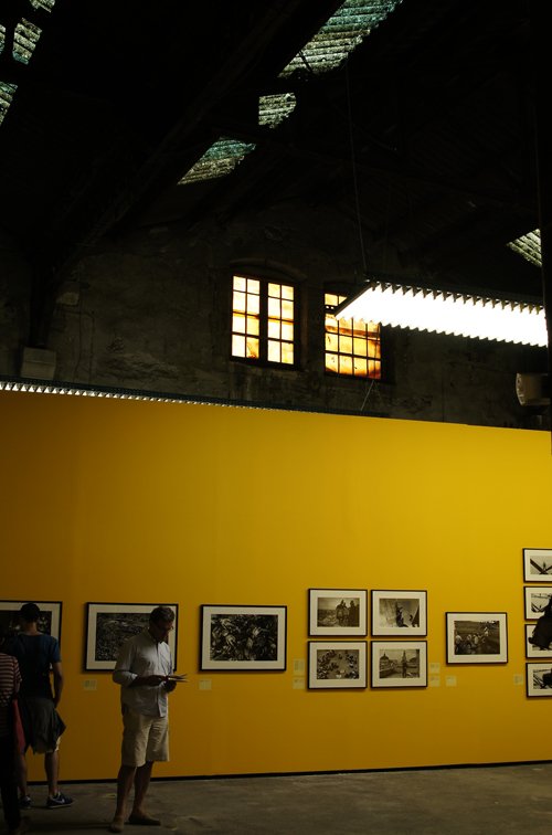
In terms of pesentation there was just about everything. The venue in the old railway yard was facinating in itself to the point where I could have happily wandered round it if it had been empty.  The photos below give a taste of this:


This is a brief taste of the event. Next time I'll spend more time there. I saw so much and missed so much more, but I thoroughly enjoyed it. If we get a Manchester OCA group together I'll bring the (575 page) book along.

Wednesday, 25 May 2011

Colour: Project - Colour relationships

Exercise: Colour relationships

Aim:  This exercise is in two parts.  Firstly three images expressing the primary colours with their complementary  secondary colours using the specific ratios suggested by Von Goethe and secondly three images of alternative colour combinations that appeal with an explanation of why.

Approach and results:

I found that my attraction to colour was not always down to the colour itself.  In previous ‘points’ exercises it has been necessary to view the shots in black and white to ensure that the colour was not influencing the points in the frame.  I found the reverse in this exercise; I had to dismiss the object and think about the colour.  So a blossom tree that looked spectacular because of it's scale was not necessarily a good subject when you just think about the colour.

Red:Green - ratio 1:1.  This shot was side lit to avoid any shadows and to keep the red background from reflecting the flash.  The red has varying tones that follow the same lines as the leaf.  The green has the greatest tonal range giving the leaf more depth and making it stand out more.  The ratio of 1:1 only works if the colours are of the same brightness but also the subject influences how the eye sees the picture.  In this picture the red is the background and not a specific object vying for dominance with the leaf.   


Orange:Blue - ratio 1:2.  This shot was taken early afternoon when the light was fairly neutral.  I would normally have taken the roof line further up to the corner but this would have changed the colour ratios giving me too much blue.  I like the bold blocks of colour and simple lines.  Again there is a range of tones from the softer blue sky through to the deep blue of the shadows on the wall and the more vivid orange of the door.


Yellow:Violet - ratio 1:3.  Finding violet and yellow was quite a difficult task.  It is not a popular combination in the urban environment.  I created this shot by picking the yellow flower and placing it in the shot whilst trying to keep it looking natural.  I feel that nature makes a better job of violet and yellow combinations that don't appear as pleasing or complimentary in the urban environment.


Green:Orange - ratio 4:1.  These colours are offset on the colour wheel and are therefore not obviously complimentary.  The orange is brighter and stronger than the green and provides a series of points of interest, drawing the attention of the eye.  It is definately the colour that makes this image.  If you picture it in black and white it becomes a collection of flowers and leaves that makes the viewer wonder why the shot was taken. 


Red:Orange - ratio 5:1.  There are many shades of red in this image so judging the ratio is not so easy.  These colours are next to each other on the colour wheel and both on the 'warm' side.  This creates a rich, warm, almost glowing image.


Violet:Red - 2:1.  These colours are next to each other on the colour wheel but fall on different sides, warm (red) and cool (violet).  The red is bright and vibrant so I chose to make it smaller.  The violet would have been overpowered and insignificant otherwise.  The overall result is still a warm image as the firey red is enhanced by the rich violet.


Learning points:  I find the 'supposed' complimentary colour combinations less interesting or appealing than those that create a warm or cool image.  I also prefer the offset combinations that create tension in an image.
It is important to take into account the significance of the subject when identifying colour; is it the colour or the subject that attracts?  I was completing this exercise whilst blossom trees were out but if the same colours were shown to me in say a handful of sweets would I be drawn to them in the same way? – I doubt it!
The ratios are a guideline and only work for the average brightness.  A very dark green against a bright red would not warrant a 1:1 ratio.
The colour reproduction on the blog is, as ever, not faithful.

Monday, 23 May 2011

Colour: Project - Building a library of colours

Exercise: Primary and secondary colours

Aim:  The aim of this exercise is to take images dominated by a single colour from the colour wheel, vary the exposure (over and under) and then select which is the closest match to the colour wheel.

Approach and results:

The exercise suggests changing the aperture to get the different over/under exposure.  When taking pictures where a colour fills the frame you are usually close or zooming in.  Either way you will generally have a fairly shallow depth of field.  Altering the aperture rather than the shutter has a more noticeable effect on the image.  I altered the shutter for the violet pansies as I was so close that the depth of field would be lost.  I was working with a shallow depth of field anyway as I needed to capture the flowers without motion blur created by the breeze.

Metering – the evaluative meter is ok if the colour fills the frame.  If the colour fills part or even the majority then the spot meter is better, especially if the other elements in the frame are of a distinct difference in brightness as the evaluative metering starts to compensate.  The orange tulips are an example of this.


 The results varied due to the metering on the camera and shrinking the images for the blog has made many of them look the same.  My preferences are as follows;

Yellow - overexposed.  This was closest to the real thing.  The large area of yellow (naturally bright) has caused the camera to underexpose.
Orange - correct exposure.  Over exposure produced false colour.  Under exposure lost the original brightness.
Violet - Underexposed - To keep the depth of colour the underexposed shot was most accurate.
Red - Overexposed.  Here the camera has compensated for the bright tomatoes and bright background by under exposing.
Green - Correct exposure.  A wide range of greens and more varied brightness has resulted in an even exposure.
Blue - Underexposed.  As a transparent subject with quite a lot of white reflections this looked more accurate underexposing, keeping the depth of colour.

The main learning point is that the brightness of the colour determines how the scene is metered and this needs to be taken into acount when taking the final shot.  I have experienced this when shooting in woodland and finding the camera wants to brighten the scene all the time.  I generallt need to underexpose to recreate darker scenes.

Interestingly it is the brighter colours from the colour wheel that benefitted more from overexposing to maintain the brightness and the darker colours that benefitted more from under exposing to keep the original depth of colour.


Saturday, 21 May 2011

Colour: Project - Colour relationships

Exercise: Colours into tones in black and white


Aim: The aim of this exercise is to show how black and white tones can be controlled by the use of coloured filters.

Approach and results:

I chose to use jpeg images in Photoshop so that I could alter the colour sliders or select the preset filter options.  Having ‘played’ with the sliders I then chose to use the set filters for the exercise as these presumably represent existing filter standards?  It is interesting to note that in replicating the filters, Photoshop did not just boost the chosen colour.  Taking blue as an example, reds, greens and yellows were reduced whilst cyans, blues and magentas were raised.  I expected some levels to be reduced in compensation but wasn’t sure which ones.  It would be an interesting comparison to do the exercise with the camera set to black and white with coloured filters on it.

I spot metered on the grey card and lit the still life with a single wireless flash and softbox.  As this was a technical exercise I didn’t spend too much time on composition, choosing to concentrate on the colour.  However, I chose flash as my test shots using daylight were dull, rather flat and unevenly lit.  Flash gave even lighting, vivid colour and depth.

The web images below are not entirely representative of the results.  They are all darker than the originals.  This is something I find continually when using the blogging software.

The most dramatic effect was made using the blue filter.  Applying the blue filter made the blue towel much brighter but turned everything else almost black.  I'm assuming the reason for this is that there is no blue in any of the other objects.  The other filters are not as dramatic because the objects contain a range of overlapping colours and shades.  There was very little difference between the red and yellow filters.  Yellow made the red pepper and the flowers slightly brighter than the red filter.  The green filter brought the brightness of the green pepper closer to that of the red pepper giving it equal emphasis in the frame.

Altering colours using Photoshop in the past I have found any particular colour can have a range of other colours that are not obviously visible.  For example there is usually a lot of yellow in a green landscape so adjusting green does not have as dramatic an effect as adjusting yellow.

The grey card remained consistant except for the blue filter.  There is an element of blue making up the grey in the image.  I zoomed in to pixel level on the grey card and there are faint hints of blue that will have been affected by the filter.


Original


Default


Blue filter


Green filter


Red filter


Yellow filter

Learning points:
It was useful to note what changes Photoshop used as defaults for different filters.
It was also useful to learn how I could control the tones of any of the colours in the image altering the viewers focus on the different objects in the frame.
You can narrow the bands of colour controlled by the sliders in Photoshop if you wish to be very specific e.g. raising the orange slider can affect the red and yellow depending on how close they are to the orange.