Wednesday, 21 September 2011

Light:Project - Photographic lighting - contrast and shadow fill

Exercise: contrast and shadow fill

Aim:  the aim of this exercise is to use different types of reflector to create shadow fill and to note the difference created by different distances and surfaces.

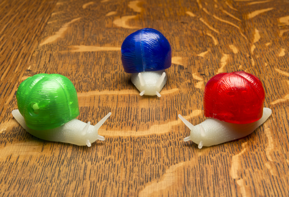
Approach and results: I first tried this exercise with the cactus that I used in previous exercises but the results were not so obvious.  For a bigger subject I think I needed a bigger reflector.  the snails are useful to compare the effects on colour.  The results were quite subtle in some instances but none the less made a difference.  As I was quite close I used F16 throughout in order to get sufficient depth of field.  Some of the differences will also come from the fact that I was hand holding the reflector so the position is not identical on each image.

The first shot was taken with no diffuser.  The light is harsh and the table top has a light sheen on it.  The second shot was with a 60cm softbox.  This has reduced the exposure, strenghtening the colours but there is a lot of shadow.  The third shot uses a white card reflector on the opposite side to the flash and a similar distance away (1m approx).  This had very little effect at all.  You could say that it very slightly lightened the shadows but it is marginal.  The light reaching the reflector is 4 times less than the light reaching the subject as the reflector is twice as far away.  This is before you take into account the distance that the light is reflected back (a further 1m).  It is therefore not surprising that the light reflected back has little impact.  The forth shot brings the reflector twice as close and there is a noticable difference.  The green and red shells are more evenly lit, the green snail body is more visible and the table top detail is clearer and less shadowed.

Shots 5,6 and 7 use foil as the reflective surface.  Firstly using the dull side, then the shiny side and finally a crumpled shiny side.  The foil is more reflective than the card and lightens the shadows still further.  It is not until the foil is used that the face of the red becomes lit at all.  The shiny side of the foil is by far the most effective as a reflector.  There is clearly detailed relief on the side of the green snail.  Crumpling it makes it slightly more diffuse and less directional, brighter than the dull side but softer.


Learning points:
Up until now I have always used a piece of white card when I needed to reflect light apart from one occasion where I used a silver tray to create a spotlight.  Changing the type of reflector can have a subtle but significant effect. The results with the foil shiny side out and crumpled are the most impressive as it managed to reflect more light but keep it diffuse.
A reflector needs to be qiute close to be effective because of the light fall-off. 

Light: Project - Photographic lighting - softening the light

Exercise: softening the light

Aim:  The aim of this exercise is to understand the effects of softening the light source with a diffuser.

Approach and results:

I chose a simple still life for this exercise and lit it from overhead.  The first shot was direct flash from a wireless flashgun.  The second shot was with the same flashgun with a 60cm softbox over it.  as you can see from the images, the shadows are much sharper, darker and well defined.  The highlight on the snail shells is smaller but better defined and the sides of the shells are not as well lit.  Also the grain on the table top is better defined and colours in general appear more saturated. 


Whether diffusion is an improvement depends on what you want from the image.  If this was a product photography shot then the diffused shot would be my choice as the shadows are less distracting and there is a more even light.  If I wanted to highlight detail then the straight flash shows up more relief in the surfaces due to the sharp shadow lines.  If this were a portrait then diffused light would be far more flattering.

Learning points:
Direct flash shows more detail and relief.  Diffused light gives softer shadows and larger highlights.  Diffused light is usually a larger light source and envelopes the subject more.

Tuesday, 20 September 2011

Light: Project - The time of day

Exercise: cloudy weather and rain

Approach and results:

Part 1 - cloud vs sun: The following pairs of images were taken on days when the sun was in and out of the cloud.  The aim of the exercise is to compare the changing levels of colour and exposure and the effects they have on the overall image.

This first pair of images were taken inside Manchester Catherdral.  I wanted to capture how the light shone through the large leaded windows.  The first shot was taken with the sun out at F5 and 1/400sec.  The second shot was with the sun behind the cloud and was F5 but 1/125sec, so approximately 1 1/2 stops slower than the first.  The cloudy shot is also bluer than the sunny shot.  In terms of recognising what the shot actually is, the cloudy shot is clearer as the confusing shadows cast by the leaded glass are not apparent.  That said, I took the shot because I liked the myriad of patterns created by the shadows and it is the sunlit shot that I prefer.


This second pair of images are of a security guard in a stockport shopping centre. The shaded image was taken at F7.1 and 1/320sec whilst the sunny image was taken at F7.1 and 1/400sec but is slightly overexposed.  One stop difference would probably work better.  Detail in the stonework has been lost and the gradually changing tones that give depth are also considerably less obvious in the sunny image.  However, the guard is better lit and defined in the sunny image.  I like the fact that (as a security guard) the light shades have gone from over his head.  The shady shot is also bluer than the sunny shot.


This third pair of images are also of a Stockport shopping centre.  I chose this view because of the potential light and shade and also because of the large amounts of glass.  The sunny shot was taken at F5.6 and 1/250sec whilst the cloudy shot was taken at F5.6 and 1/400sec.  This would appear to be the wrong way round!  However, with the sun out there is a large area of shade created which has obviously registered with the evaluative metering.  The building on the right is still exposed correctly but has more definition.  The sunny shot is much warmer. The cloudy picture is still very bright as the cloud was not too thick.  It is more evenly lit and there is a lot more cloud reflected off of the glass roofing which probably explains the unexpected light readings.


Part 2.1 - The aim of this exercise is to select two of my previous images that would not benefit from being taken in bright sunlight.

In this first image I wanted to capture the bleak solitute of a cold early winter morning.  The only people out were dog walkers.  There was a layer of mist across the bare football pitch and the sky was gloomy.  If this had been a clear bright day the image would turn into a crisp winter morning and the mist probably wouldn't have been there in the first place.


This second image is of a small backstreet in Manchester.  the buildings are close together so not much room for light.  Any strong sunlight would have been very directional and would have lightened some areas and not others creating a high contrast and loosing some of the detail that I wanted to capture. 

Part 2.2 - The aim here was to capture 3 images that would look better taken under cloudy conditions with a more flat even light.  It was a bright but cloudy day when I took these images.

The first picture of the wet handrail shows gradual tones giving depth and highlighting the shape of the rail.  In bright sun there would have been a very bright reflection resulting in losing a lot of the rail (or the highlights being blown out).

The second image is from a shop window display.  Again the detail and shading that is present would have been difficult to reproduce in bright sun as would the range of yellow hues in the pencils. Taking the picture through glass would also be more problematic in bright sun.

The third image of the statue has a lot of detail and relief.  Also the picture is taken upwards towards the bright sky.  The detail in the statue is visible with not too many harsh shadows making the figure hard to define.  The raised names on the base are actually readable on a larger image but this would be more difficult if sharp long shadows were cast as a result of strong sunlight.


Part 3 - rain:  As much as I hate the rain, it can be great for photographs.  Living in Manchester I might as well make use of this abundant resource!  This first shot was taken at an open air lido where the rain doesn't really matter, once you're wet, you're wet!  It was the bubbles forming as the raindrops hit the surface that attracted me to the shot.  This was only evedent when the rain was not too hard.  Heavy rain just broke up the surface.  I took the shot from distance (under cover) and used a shallow depth of field to focus on the near centre of the pool.  This also gave me an ideal shutter speed to capture the bubbles.  This shot looks much better larger but the blogging software only gives a few size options.  The next size up is too big for the page!


This second shot is of raindrops on the patio doors at home looking down the garden.  I kept perpendicular to the window, fairly low down so that I could maintain focus across the window and keep the background dark.  I took a shot higher up with a brighter background but prefer this one.  I used F8 to keep the depth of field.  I like the fact that there is an inverted view of the garden in every drop, with the green lawn at the top and the grey sky at the bottom. 


Learning points:

I tend to take most of my pictures in brighter weather.  This became self evident when I had to look back for two shots that would not benefit from being taken in strong sunlight.  They were quite hard to find!  My camera is not weather sealed and I think I'm quite concious of this.  I also have a preference for high contrast images with lots of blacks and you can't get this on a grey day.  That said, some shots that I would have naturally taken in sun, such as the hand rail, actually work considerably better in shade.  There is a subtlety in contrast that allows wide ranges of detail and colour to be captured without exceeding the dynamic range of the camera.  The 'all or nothing' high contrast image doesn't lend itself to gradual changes in tone that, for example, make the handrail look round or give it depth.

I'm still not quite sure I have hit upon why the cloudy shopping centre picture had a faster shutter speed.  Surely the yellow wall of the shopping centre should look overexposed but it doesn't?

Thursday, 8 September 2011

Light: Project - The colour of light

Exercise: judging colour temperature 2

Aim:  The aim of this exercise is to take three sets of three pictures, midday shade, midday sun and evening sun with shade, sun and auto WB settings and to interpret the results.

Approach and results:  For the first part of this exercise I used a day when the sun was in and out of the clouds giving me the opportunity to get the shots in reasonably quick succession.  Grabbing the short bursts of sunshine available meant asking Katya to run out into the garden at short notice and me taking the pictures as quickly as possible, so the portraits aren't particularly good!
These first 3 pictures were taken when the sun was behind the clouds.  The first image uses AWB and is rather cool.  There appears to be no adjustment for the shade.  It was still a bright day so this may be an issue.  The 2nd picture has the WB set to shade.  This has corrected the previous cool and is much more representative of the actual light.  The 3rd picture uses the sunny WB setting and has consequently produced a cool image much like the AWB shot.  If anything the AWB shot is the coolest of the 3.
light=Shady, WB=AWB

light=Shady, WB=Shade

light=Shady, WB=Sun
These next three pictures where taken when the sun was out.  The 1st was with AWB and again is the coolest of the 3.  The 2nd shot is with the WB set to shade and has warmed up the image.  Although I find this the better of the 3 images, it is not representative of the conditions.  The 3rd shot is with the WB set to sun.  This is the most accurate, being slightly warmer than the AWB but cooler than the shady WB.
light=Sunny, WB=AWB

light=Sunny, WB=Shade

light=Sunny, WB=Sun
These last three pictures were taken using the low evening sun.  They were taken in quick succession as the light was changing rapidly.  The first shot was with AWB and, in this case is the most accurate.  The 2nd shot is with the WB set to shade and is far too warm and yellow as you would expect.  The 3rd shot is with the WB set to sun and is the coolest of the 3 images, but only slightly.
Light= late sun, WB=auto


Light= late sun, WB=shade

Light= late sun, WB=sun
Learning points:

The auto white balance from my camera is slightly on the cool side for portraits.  I prefer a warmer result.  This would not necessarily be the case for other types of shot but warmer skintones are generally more flattering.  I've never used the scene modes on my camera but it makes me wonder what result I would get if I set it to portrait.
Interestingly the AWB in all cases above has produced a similar result to the sunny WB.
If I'm not getting the WB I want I usually set it manually on the Kelvin scale.
It's worth taking note exactly how your particular camera judges scenes so you know what expect in future.

Wednesday, 7 September 2011

Light: Project - The colour of light

Exercise: judging colour temperature 1

Aim:  the aim of this exercise is to understand the effects of colour temperature and white balance at different times of the day.

Approach and results:

I chose to shoot three pictures of my partner whilst on holiday.  One in full sun at midday, one in shade at midday and one as the sun was dropping in the late afternoon.  The camera's white balance was set to sunny.  As this is a direct comparison I haven't done any post processing.  At the time my thoughts were that the midday sun was neutral but harsh, the shade was neutral but softer and more even and the late afternoon sun was warmer but not overly warm.

This first image is the sun at midday and is fairly accurate if a little cool.  You can see by the shadows that the sun was almost directly overhead producing a very harsh, unflatering light.  The second image is midday shade and the image is definately cooler or bluer than it should be.  The sunny WB has overcompensated in the shade.  The late afternoon image is not overly warm.  I think taking the shot later still would change this.  The colours look warm but the skin tone does not.  The defocussed lavendar in the background is certainly warmer than earlier in the day (the main reason we were there).


Midday sun

Midday shade

late afternoon sun
 Learning points:

If you chose to control the white balance it is necessary to change it to suit the scene and not, for example,  just leave it on sunny on a sunny day.  It is important to know what you camera will do at certain WB settings.  I don't think I was aware that the sunny WB would cool down the shadey image quite so much.

If you use AWB it is important to get to know what your camera will do.  My experience with my camera is that if left to it's own devices in shadier situations the images can be on the cool side.  Particularly in woodland or tree shade.  In tricky situations I will use the kelvin scale and the live view to adjust the WB.

Tuesday, 6 September 2011

Light: Project - The intensity of light

Exercise: Higher and lower sensitivity

Aim:  The aim of this exercise is to investigate the difference in using a range of ISOs and the trade off between being able to take a shot and the noise levels in the image.

Approach and results:

I started by using ISO 100 in as lower light as possible to the point where I was relying on the image stabilisation for some of the shots and on close inspection there was still some movement.  The images only really became pin sharp at ISO 800.  I took the same shot using ISO 100 to ISO 3200.  In reducing the images for the blog any close-up comparison is impossible as there is no longer enough detail to compare.  Therefore I have sampled some of the areas in the images.

For the first example I chose an image with a range of colours and have enlarged ISO400 and ISO3200.  ISO400 shows no noise in any areas.  800 was slightly sharper but there were some speckles creaping in under close inspection.  1600 was noisier still and 3200 was the worst.  It was most noticable in the soft, out of focus areas.  The grey or midtone areas also show more noise.  Blacks were handled quite well which is surprising.  Any large plain area had a tendency to highlight noise.  That said, even the 3200 when viewed normally was far better than I expected and probably usable to a reasonable size.  I would have thought this would be limited to small web images but this exercise has changed my mind. 

Original

ISO 400


ISO 3200

For the second example I have enlarged ISO100 and ISO800.  As this is a close up shot I needed a small aperture to get the required depth of field.  The result is that ISO100 is not fast enough to keep the image sharp.  ISO800 is a far better result and a more usable image with very little if any noticable noise introduced.


Original

ISO 800 (top) and ISO 100 (bottom)

I also tried the multi frame noise reduction option on my camera which works at all ISOs and takes a series of images to reduce noise.  This worked very well and is a useful tool for low light static images.

Learning points:

I don't need to be too worried about using higher ISOs and I can be much more flexible with the ISO range that I use rather than generally leaving it on 200 and using maximum apertures.
In scenes with large plain areas it is worth using as low ISO as you can as this is where it becomes most obvious.
A slight amount of noise will always be preferential to a blurred image.
This does not make me want to use auto ISO as I still want to know what ISO is being used.

Light: Project - The intensity of light

Exercise: Measuring Exposure

Aim:  This exercise is in two parts.  Part one is a series of shots that are deliberately lighter or darker than average with a description why.  Part two is series of 5 shots but for each shot there are 5 exposures based around the average to see whether lighter or darker exposures are more accurate or provide a better image.

Approach and results:

Part 1:  The first thing to note here is that the shots that are deliberately dark have small but bright points of interest that do not look good shrunk for the blog.  The following three images are all darker than usual because I wanted the particular bright areas to be the interest in the picture.  In the first picture it was the shaft of light round the end of the arch and the sunlit leaves that caught my eye.  I took a series of pictures to get to this result.  The first picture gave an even exposure bringing all the detail out in the foreground and walls but blowing out the sunlit areas.  At this point I set the camera to manual, set the aperture I wanted for the depth of field and then altered the shutter speed until I got the result I wanted.
For the shot of the church window I took a spot reading from the window as the average exposure lost all detail in the stained glass (which was the reason for the picture).  I then set the exposure in the same way as I did for the first picture.  I approached the shot of the stairs in the same way.

F7.1 1/125sec ISO200

F7.1 1/100sec ISO200

F5.6 1/200sec ISO200
The next two images are lighter than average.  This first image had dark shadows and a lack of detail in the window, lemon and chillies.  I took a different approach to getting the exposure I wanted by using the cameras exposure compensation and pushing the exposure by 0.7 stops.  I did this in aperture priority so the camera did not alter the depth of field.  This brought back the detail I wanted whilst only lightening the brickwork by a small amount.  I have no idea why a lemon and some chillies were nailed to a wall in a Manchester back street!!
For the second shot of the vine I took a spot reading off the grapes as the first exposure made them too dark with very little detail.  The background is now bright but surprisingly acceptable as it is not the focus of the picture.

F8 1/30sec ISO200

F4.5 1/160sec ISO200
Part 2: For this part of the exercise I took 5 seperate pictures but bracketed the exposures one stop either side in half stop increments.  The aim is to see what acceptable tolerances there are around the average exposure.  Bracketing is something that I used to do a lot with film as you were never sure of the result.  Using digital this is not something I do as much anymore.  I used the evaluative metering for all the images.  The results depend on two things; how the camera metered the scene and what I wanted in the image in the first place.

Using the first shot of the stained glass window, half a stop over brings out more green in the image, the white remains bright, the writing in the middle is clear and the blacks are still black.  One stop over makes the writing blown out by the white background.  Under exposing makes the white start to look grey and more of the green turns almost black.

The second shot of the bins is tolerable half a stop either side but not any further.  One stop over washes out the colour in the bins and one stop under loses the red bins in the background.

The third shot of the backstreet is interesting as I think all the results are ok depending on what you are looking for.  The overexposed shots bring out the detail in the dark backstreet without overexposing any particular area giving it an almost filmset appearance.  The underexposed shots create a darker,more realistic but more mysterious image reminiscant of the large areas of black in a Bill Brandt type image and would probably look good in black and white.   

The most obvious use for bracketing is in the 4th image where the sky and ground are 50/50 making the average less predictable.  In this case the under exposed shots are preferable as the detail in the tree and sky is not lost.

The fifth image suffers as a result of the sun going in and out so the average shot is brighter than the others.  As you under expose the detail in the sky comes out more but this is not the main focus of the picture and therefore does not work.


Learning points:

There are a number of ways to get the exposure you want including using the right metering method, bracketing, using the cameras exposure compensation or using manual mode.
I was surprised to see how many of the over/under exposed images were actually ok in my eye.
If the subject is correctly exposed there is more tollerance for areas of the picture that are too dark or too light.
Images with less extremes of light and dark are more tollerant to over or underexposer.

Technology has moved on.  I can expand the dynamic range in camera which also has built in HDR but these functions should be used with caution.  Extremes of light and dark can be an important part of the image the photographer wants to create and evening things out can be detrimental as it changes the focus of the picture and can reduce the dramatic impact.