Saturday, 24 September 2011

Light: Project - Photographic lighting - shiny surfaces

Exercise: shiny surfaces

Aim:  The aim of this exercise is to learn how to deal with the unique problems created when photographing highly reflective surfaces such as stainless steel or chrome.

Approach and results:

For this exercise I hunted round the house for a suitable stainless steel object.  I found it in a Georg Jensen tea light holder.  Georg Jensen is a Danish designer whose designs are usually very clean lined stainless steel.  The tealight holder had a smooth round surface that reflected the camera no matter where you put it; perfect.  I then turned my attention to the home made funnel 'light tent'.  I did not have any tracing paper but I do have a sheet of white translucent polyproplene which fitted the bill.  I used a white card background deliberately as refering to 'Light Science and Magic' a dark base would have taken the light away from the front of the tealight holder.  As it turned out I couldn't get the funnel to bend enough to see the front of the tealight anyway; not without letting light and other reflections in.

The following two shots are without the light tent.  The first shot was without flash and, as you can see the reflection in the surface shows not only me but the whole room.  There are also a series of shadows and reflections caused by the window light.  For the second shot I used direct flash mounted on the camera with a small softbox on it.  This gives a bright spot for the flash and darkens the rest of the image, not really giving a true rendition of the tealight.  There are some fine surface marks near the bright spots and a dark shadow at the front. 

No flash

Flash mounted on camera

The following four shots are taken with the light tent and the flash in different positions.  The immediate and quite dramatic improvements are obvious.  Firstly there is nothing reflected in the surface, giving the tealight smooth clean visible lines.  The shape is more easily recognised.  Secondly the diffuse, angled lighting shows the stainless steel finish without darkening it due to under exposure created by a direct flash reflection.  That said, not all the shots are good.  The first shot has created two large bright spots around the rim of the tealight.  Moving to the right has removed these spots and produced a better result.  Moving to the left has produced another bright spot on the rim because of the angle of the tealight.  Shooting from the top has produced a more evenly lit shot but it also produces a slight, but more obvious shadow.  This is not necessarily a bad thing as I think it shows off the depth of the tealight more.  

Front right

Right


Left


Top

Learning points:
When photographing shiny objects it is important to remove as much of the surrounding reflection as possible as reflections detract from the shape of the object by breaking up lines.
Diffuse lighting produces a much more accurate and even exposure, showing the surface in its true light.  This also covers imperfections in the surface.
 In general the lighting needs to be taylored to the object so that there are no direct reflections from the light source causing hot spots.

Wednesday, 21 September 2011

Light: Project - photographic lighting - lighting angle

Exercise: The lighting angle

Aim: The aim of this exercise is to light an object from a variety of different angles and to understand the effects this has on the image produced.

Approach and results:

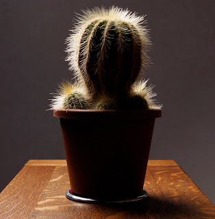
For this exercise I wanted something that had a variety of angles that would show the effects of the lighting.  I chose a cactus as it was round but with grooves in it and the spikes should show up as highlights depending on the angle.  I put the cactus on a small table in the middle of the room and put a white background behind it.  This first set of 5 images were taken with the light source at the same height as the camera and the subject.  It is only the light source that has been adjusted in the images, starting at 0 degrees, then 45, 90, 135 and finally 180.

The first shot is with the flash from the front (very slightly left) and has created an even but flat result.  There is very little shadow or contrast to give depth to the cactus.  This is fine to identify this as a cactus but not to highlight its qualities or features.    

Placing the flash at 45 degrees creates more shadow and a sense of depth in the grooves in the cactus,  The pot also starts to take on a rounded shape with greater depth.

At 90 degrees things change more dramatically.  The pot is half in shadow, the edges of the grooves become more highlighted and the spines on the cactus seem to multiply considerably.  the cactus and pot look more rounded but there is a loss of detail on the right hand side and the detail in the grooves is now in shadow.

At 135 degrees the light acts more like a rim light, lighting one edge of the subject and defining its profile.  Again the spines are highlighted as are the edges of some of the grooves.

The silhouette is completely different.  There is not detail or depth, just the outline shape barely definable as a cactus.  I am surprised that the spines do not show up more than they have.  Being fine the direct light will refract round them and they will be masked by the blown out white background.


For this second set of images the light was raised and angled down at 45 degrees and then moved round the plant in the same way as the first set of images.  The first image is from the front but unlike the first set of images the light source is already at 45 degrees on one plane, creating a greater sense of depth due to the shadow around the base of the cactus.

This second image is at 45 degrees and makes the cactus look consideably more round.  There is a greater sense of depth and a far more 3D feel to this image.  There is also a shadow on the table because of the lighting angle which gives more depth to the table.

At 90 degrees the spines again become more visible and the grooves in the cactus become more shadowed highlighting their depth.  The pot appears to be more than half in shadow as the down lighting accentuates the rim of the pot.

At 135 degrees more of the cactus is lit compared to the first set of images.  The cactus keeps its rounded feel as the light shines over the top and acts as more than just a rim light.

At 180 degrees the result is very different from the first silhouette.  Although this is almost a silhouette, the bright white background has gone and the spines are much clearer.  There is some detail at the very top still suggesting a ball shape.

Learning points:
The lighting angle can completely change the view of any subject and can be used to show shape, form and texture.
The most rounded image is with the lighting at 45 degrees from the side and 45 degrees from the top.  This captures the depth and roundness on more than one plane.
The spines seem obvious in the early shots but clearly only become really prominent from 90 degrees onwards.
My favorite is the last image as it makes the cactus look more like a charachter from a horror movie!

Light:Project - Photographic lighting - contrast and shadow fill

Exercise: contrast and shadow fill

Aim:  the aim of this exercise is to use different types of reflector to create shadow fill and to note the difference created by different distances and surfaces.

Approach and results: I first tried this exercise with the cactus that I used in previous exercises but the results were not so obvious.  For a bigger subject I think I needed a bigger reflector.  the snails are useful to compare the effects on colour.  The results were quite subtle in some instances but none the less made a difference.  As I was quite close I used F16 throughout in order to get sufficient depth of field.  Some of the differences will also come from the fact that I was hand holding the reflector so the position is not identical on each image.

The first shot was taken with no diffuser.  The light is harsh and the table top has a light sheen on it.  The second shot was with a 60cm softbox.  This has reduced the exposure, strenghtening the colours but there is a lot of shadow.  The third shot uses a white card reflector on the opposite side to the flash and a similar distance away (1m approx).  This had very little effect at all.  You could say that it very slightly lightened the shadows but it is marginal.  The light reaching the reflector is 4 times less than the light reaching the subject as the reflector is twice as far away.  This is before you take into account the distance that the light is reflected back (a further 1m).  It is therefore not surprising that the light reflected back has little impact.  The forth shot brings the reflector twice as close and there is a noticable difference.  The green and red shells are more evenly lit, the green snail body is more visible and the table top detail is clearer and less shadowed.

Shots 5,6 and 7 use foil as the reflective surface.  Firstly using the dull side, then the shiny side and finally a crumpled shiny side.  The foil is more reflective than the card and lightens the shadows still further.  It is not until the foil is used that the face of the red becomes lit at all.  The shiny side of the foil is by far the most effective as a reflector.  There is clearly detailed relief on the side of the green snail.  Crumpling it makes it slightly more diffuse and less directional, brighter than the dull side but softer.


Learning points:
Up until now I have always used a piece of white card when I needed to reflect light apart from one occasion where I used a silver tray to create a spotlight.  Changing the type of reflector can have a subtle but significant effect. The results with the foil shiny side out and crumpled are the most impressive as it managed to reflect more light but keep it diffuse.
A reflector needs to be qiute close to be effective because of the light fall-off. 

Light: Project - Photographic lighting - softening the light

Exercise: softening the light

Aim:  The aim of this exercise is to understand the effects of softening the light source with a diffuser.

Approach and results:

I chose a simple still life for this exercise and lit it from overhead.  The first shot was direct flash from a wireless flashgun.  The second shot was with the same flashgun with a 60cm softbox over it.  as you can see from the images, the shadows are much sharper, darker and well defined.  The highlight on the snail shells is smaller but better defined and the sides of the shells are not as well lit.  Also the grain on the table top is better defined and colours in general appear more saturated. 


Whether diffusion is an improvement depends on what you want from the image.  If this was a product photography shot then the diffused shot would be my choice as the shadows are less distracting and there is a more even light.  If I wanted to highlight detail then the straight flash shows up more relief in the surfaces due to the sharp shadow lines.  If this were a portrait then diffused light would be far more flattering.

Learning points:
Direct flash shows more detail and relief.  Diffused light gives softer shadows and larger highlights.  Diffused light is usually a larger light source and envelopes the subject more.

Tuesday, 20 September 2011

Light: Project - The time of day

Exercise: cloudy weather and rain

Approach and results:

Part 1 - cloud vs sun: The following pairs of images were taken on days when the sun was in and out of the cloud.  The aim of the exercise is to compare the changing levels of colour and exposure and the effects they have on the overall image.

This first pair of images were taken inside Manchester Catherdral.  I wanted to capture how the light shone through the large leaded windows.  The first shot was taken with the sun out at F5 and 1/400sec.  The second shot was with the sun behind the cloud and was F5 but 1/125sec, so approximately 1 1/2 stops slower than the first.  The cloudy shot is also bluer than the sunny shot.  In terms of recognising what the shot actually is, the cloudy shot is clearer as the confusing shadows cast by the leaded glass are not apparent.  That said, I took the shot because I liked the myriad of patterns created by the shadows and it is the sunlit shot that I prefer.


This second pair of images are of a security guard in a stockport shopping centre. The shaded image was taken at F7.1 and 1/320sec whilst the sunny image was taken at F7.1 and 1/400sec but is slightly overexposed.  One stop difference would probably work better.  Detail in the stonework has been lost and the gradually changing tones that give depth are also considerably less obvious in the sunny image.  However, the guard is better lit and defined in the sunny image.  I like the fact that (as a security guard) the light shades have gone from over his head.  The shady shot is also bluer than the sunny shot.


This third pair of images are also of a Stockport shopping centre.  I chose this view because of the potential light and shade and also because of the large amounts of glass.  The sunny shot was taken at F5.6 and 1/250sec whilst the cloudy shot was taken at F5.6 and 1/400sec.  This would appear to be the wrong way round!  However, with the sun out there is a large area of shade created which has obviously registered with the evaluative metering.  The building on the right is still exposed correctly but has more definition.  The sunny shot is much warmer. The cloudy picture is still very bright as the cloud was not too thick.  It is more evenly lit and there is a lot more cloud reflected off of the glass roofing which probably explains the unexpected light readings.


Part 2.1 - The aim of this exercise is to select two of my previous images that would not benefit from being taken in bright sunlight.

In this first image I wanted to capture the bleak solitute of a cold early winter morning.  The only people out were dog walkers.  There was a layer of mist across the bare football pitch and the sky was gloomy.  If this had been a clear bright day the image would turn into a crisp winter morning and the mist probably wouldn't have been there in the first place.


This second image is of a small backstreet in Manchester.  the buildings are close together so not much room for light.  Any strong sunlight would have been very directional and would have lightened some areas and not others creating a high contrast and loosing some of the detail that I wanted to capture. 

Part 2.2 - The aim here was to capture 3 images that would look better taken under cloudy conditions with a more flat even light.  It was a bright but cloudy day when I took these images.

The first picture of the wet handrail shows gradual tones giving depth and highlighting the shape of the rail.  In bright sun there would have been a very bright reflection resulting in losing a lot of the rail (or the highlights being blown out).

The second image is from a shop window display.  Again the detail and shading that is present would have been difficult to reproduce in bright sun as would the range of yellow hues in the pencils. Taking the picture through glass would also be more problematic in bright sun.

The third image of the statue has a lot of detail and relief.  Also the picture is taken upwards towards the bright sky.  The detail in the statue is visible with not too many harsh shadows making the figure hard to define.  The raised names on the base are actually readable on a larger image but this would be more difficult if sharp long shadows were cast as a result of strong sunlight.


Part 3 - rain:  As much as I hate the rain, it can be great for photographs.  Living in Manchester I might as well make use of this abundant resource!  This first shot was taken at an open air lido where the rain doesn't really matter, once you're wet, you're wet!  It was the bubbles forming as the raindrops hit the surface that attracted me to the shot.  This was only evedent when the rain was not too hard.  Heavy rain just broke up the surface.  I took the shot from distance (under cover) and used a shallow depth of field to focus on the near centre of the pool.  This also gave me an ideal shutter speed to capture the bubbles.  This shot looks much better larger but the blogging software only gives a few size options.  The next size up is too big for the page!


This second shot is of raindrops on the patio doors at home looking down the garden.  I kept perpendicular to the window, fairly low down so that I could maintain focus across the window and keep the background dark.  I took a shot higher up with a brighter background but prefer this one.  I used F8 to keep the depth of field.  I like the fact that there is an inverted view of the garden in every drop, with the green lawn at the top and the grey sky at the bottom. 


Learning points:

I tend to take most of my pictures in brighter weather.  This became self evident when I had to look back for two shots that would not benefit from being taken in strong sunlight.  They were quite hard to find!  My camera is not weather sealed and I think I'm quite concious of this.  I also have a preference for high contrast images with lots of blacks and you can't get this on a grey day.  That said, some shots that I would have naturally taken in sun, such as the hand rail, actually work considerably better in shade.  There is a subtlety in contrast that allows wide ranges of detail and colour to be captured without exceeding the dynamic range of the camera.  The 'all or nothing' high contrast image doesn't lend itself to gradual changes in tone that, for example, make the handrail look round or give it depth.

I'm still not quite sure I have hit upon why the cloudy shopping centre picture had a faster shutter speed.  Surely the yellow wall of the shopping centre should look overexposed but it doesn't?

Thursday, 8 September 2011

Light: Project - The colour of light

Exercise: judging colour temperature 2

Aim:  The aim of this exercise is to take three sets of three pictures, midday shade, midday sun and evening sun with shade, sun and auto WB settings and to interpret the results.

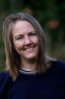
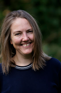
Approach and results:  For the first part of this exercise I used a day when the sun was in and out of the clouds giving me the opportunity to get the shots in reasonably quick succession.  Grabbing the short bursts of sunshine available meant asking Katya to run out into the garden at short notice and me taking the pictures as quickly as possible, so the portraits aren't particularly good!
These first 3 pictures were taken when the sun was behind the clouds.  The first image uses AWB and is rather cool.  There appears to be no adjustment for the shade.  It was still a bright day so this may be an issue.  The 2nd picture has the WB set to shade.  This has corrected the previous cool and is much more representative of the actual light.  The 3rd picture uses the sunny WB setting and has consequently produced a cool image much like the AWB shot.  If anything the AWB shot is the coolest of the 3.
light=Shady, WB=AWB

light=Shady, WB=Shade

light=Shady, WB=Sun
These next three pictures where taken when the sun was out.  The 1st was with AWB and again is the coolest of the 3.  The 2nd shot is with the WB set to shade and has warmed up the image.  Although I find this the better of the 3 images, it is not representative of the conditions.  The 3rd shot is with the WB set to sun.  This is the most accurate, being slightly warmer than the AWB but cooler than the shady WB.
light=Sunny, WB=AWB

light=Sunny, WB=Shade

light=Sunny, WB=Sun
These last three pictures were taken using the low evening sun.  They were taken in quick succession as the light was changing rapidly.  The first shot was with AWB and, in this case is the most accurate.  The 2nd shot is with the WB set to shade and is far too warm and yellow as you would expect.  The 3rd shot is with the WB set to sun and is the coolest of the 3 images, but only slightly.
Light= late sun, WB=auto


Light= late sun, WB=shade

Light= late sun, WB=sun
Learning points:

The auto white balance from my camera is slightly on the cool side for portraits.  I prefer a warmer result.  This would not necessarily be the case for other types of shot but warmer skintones are generally more flattering.  I've never used the scene modes on my camera but it makes me wonder what result I would get if I set it to portrait.
Interestingly the AWB in all cases above has produced a similar result to the sunny WB.
If I'm not getting the WB I want I usually set it manually on the Kelvin scale.
It's worth taking note exactly how your particular camera judges scenes so you know what expect in future.

Wednesday, 7 September 2011

Light: Project - The colour of light

Exercise: judging colour temperature 1

Aim:  the aim of this exercise is to understand the effects of colour temperature and white balance at different times of the day.

Approach and results:

I chose to shoot three pictures of my partner whilst on holiday.  One in full sun at midday, one in shade at midday and one as the sun was dropping in the late afternoon.  The camera's white balance was set to sunny.  As this is a direct comparison I haven't done any post processing.  At the time my thoughts were that the midday sun was neutral but harsh, the shade was neutral but softer and more even and the late afternoon sun was warmer but not overly warm.

This first image is the sun at midday and is fairly accurate if a little cool.  You can see by the shadows that the sun was almost directly overhead producing a very harsh, unflatering light.  The second image is midday shade and the image is definately cooler or bluer than it should be.  The sunny WB has overcompensated in the shade.  The late afternoon image is not overly warm.  I think taking the shot later still would change this.  The colours look warm but the skin tone does not.  The defocussed lavendar in the background is certainly warmer than earlier in the day (the main reason we were there).


Midday sun

Midday shade

late afternoon sun
 Learning points:

If you chose to control the white balance it is necessary to change it to suit the scene and not, for example,  just leave it on sunny on a sunny day.  It is important to know what you camera will do at certain WB settings.  I don't think I was aware that the sunny WB would cool down the shadey image quite so much.

If you use AWB it is important to get to know what your camera will do.  My experience with my camera is that if left to it's own devices in shadier situations the images can be on the cool side.  Particularly in woodland or tree shade.  In tricky situations I will use the kelvin scale and the live view to adjust the WB.