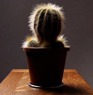
Aim: The aim of this exercise is to light an object from a variety of different angles and to understand the effects this has on the image produced.
Approach and results:
For this exercise I wanted something that had a variety of angles that would show the effects of the lighting. I chose a cactus as it was round but with grooves in it and the spikes should show up as highlights depending on the angle. I put the cactus on a small table in the middle of the room and put a white background behind it. This first set of 5 images were taken with the light source at the same height as the camera and the subject. It is only the light source that has been adjusted in the images, starting at 0 degrees, then 45, 90, 135 and finally 180.
The first shot is with the flash from the front (very slightly left) and has created an even but flat result. There is very little shadow or contrast to give depth to the cactus. This is fine to identify this as a cactus but not to highlight its qualities or features.
Placing the flash at 45 degrees creates more shadow and a sense of depth in the grooves in the cactus, The pot also starts to take on a rounded shape with greater depth.
At 90 degrees things change more dramatically. The pot is half in shadow, the edges of the grooves become more highlighted and the spines on the cactus seem to multiply considerably. the cactus and pot look more rounded but there is a loss of detail on the right hand side and the detail in the grooves is now in shadow.
At 135 degrees the light acts more like a rim light, lighting one edge of the subject and defining its profile. Again the spines are highlighted as are the edges of some of the grooves.
The silhouette is completely different. There is not detail or depth, just the outline shape barely definable as a cactus. I am surprised that the spines do not show up more than they have. Being fine the direct light will refract round them and they will be masked by the blown out white background.
For this second set of images the light was raised and angled down at 45 degrees and then moved round the plant in the same way as the first set of images. The first image is from the front but unlike the first set of images the light source is already at 45 degrees on one plane, creating a greater sense of depth due to the shadow around the base of the cactus.
This second image is at 45 degrees and makes the cactus look consideably more round. There is a greater sense of depth and a far more 3D feel to this image. There is also a shadow on the table because of the lighting angle which gives more depth to the table.
At 90 degrees the spines again become more visible and the grooves in the cactus become more shadowed highlighting their depth. The pot appears to be more than half in shadow as the down lighting accentuates the rim of the pot.
At 135 degrees more of the cactus is lit compared to the first set of images. The cactus keeps its rounded feel as the light shines over the top and acts as more than just a rim light.
At 180 degrees the result is very different from the first silhouette. Although this is almost a silhouette, the bright white background has gone and the spines are much clearer. There is some detail at the very top still suggesting a ball shape.
Learning points:
The lighting angle can completely change the view of any subject and can be used to show shape, form and texture.
The most rounded image is with the lighting at 45 degrees from the side and 45 degrees from the top. This captures the depth and roundness on more than one plane.
The spines seem obvious in the early shots but clearly only become really prominent from 90 degrees onwards.
My favorite is the last image as it makes the cactus look more like a charachter from a horror movie!


No comments:
Post a Comment