Exercise: Cropping
Aim: The aim of this exercise is to revisit 3 earlier photos and investigating a different crop of each.
Results:
The following crop was to accentuate the line of cars on the big wheel. The unexpected outcome was that I noticed the remembrance day poppies on all the carriages, changing the emphasis of the image from the lines, shapes and patterns of a big wheel to an image depicting remembrance day.
This next crop focuses on the symmetry of the building, removing any other distractions. The cloud pattern fanning out over the building becomes more important as does the large spike on the roof.
For the final image I chose to focus on the diamond pattern created by shadows of the pillars. I did this by cropping the distractions on the left and top of the frame (these were as a result of using a 95% viewfinder). I then cropped the large bright pillar on the right as it was drawing my eye. This has the effect of tightening and emphasizing the pattern on the floor
Learning points:
It is important not to settle for the image frame and composition that you originally took without exploring different crops of the image. You may find something you missed in the image or a more pleasing or balanced image.
One continual problem I have is that the 95% viewfinder on my camera means I am always cropping images and never capture what I see first off. This may have it's good side as I am always forced to revisit images.
Sunday, 21 November 2010
The Frame: Project - Dividing the frame
Exercise: Balance
Aim: The aim of his exercise is to take a number of existing pictures from previous exercises and decide how the balance works in each one.
Results:
This picture suffers from the same imbalance as the first. The larger group of people would be better placed on the right of the picture, or the shot could have been framed with the folly to the right of centre.
I have used this image as I think it is rather unbalanced. The rock is too dominant and the folly too central. Changing position slightly to make the rock more central and moving the folly to the left would work better, separating the rock and the folly.
The two images above are more complicated, with more elements to consider. That said, I think they are both evenly balanced with a number of points of interest. A'busier' picture tends to look more balanced as any imbalance is harder to identify.
Aim: The aim of his exercise is to take a number of existing pictures from previous exercises and decide how the balance works in each one.
Results:
The main focus in this picture is the folly. The other point of interest is the people. Having positioned the folly left of centre, this picture would have been more balanced if the people had been on the right side. However, the folly is well balanced against the background in this image.
This picture suffers from the same imbalance as the first. The larger group of people would be better placed on the right of the picture, or the shot could have been framed with the folly to the right of centre.
I have used this image as I think it is rather unbalanced. The rock is too dominant and the folly too central. Changing position slightly to make the rock more central and moving the folly to the left would work better, separating the rock and the folly.
The two images above are more complicated, with more elements to consider. That said, I think they are both evenly balanced with a number of points of interest. A'busier' picture tends to look more balanced as any imbalance is harder to identify.
The balance in this image is more to do with colour than subject. The yellow blue and green compliment each other as do the red and orange. I think the dominant red bottle would be better placed at the front of the line although there is symmetry with the yellow at both extremes. I would try and keep the yellow bottles symmetrical no matter what position they were in.
Learning points:
I think that a picture does not have to have an even balance or symmetry. A deliberately unbalanced picture can be used to highlight a particular subject, creating a bold or dramatic image.
The balance is more obvious in simpler images with fewer points of interest. This does not necessarily make the image any easier to balance.
Monday, 15 November 2010
The Frame: Project - Frame shapes and sizes
Exercise: vertical and horizontal frames
Aim: The aim of this exercise is to challenge the automatic reaction to take horizontal pictures and to demonstrate the virtues of shooting vertically by taking 20 vertical shots and repeating these horizontally.
Plan: I spent the day in Manchester city centre which has a wealth of subjects in a fairly compact area. Where the subject was not static, I took the vertical and horizontal images at the same time so I did not lose the comparison.
Results: First off, I've always liked taking images in portrait and don't naturally settle for the landscape format. I did tend to search for vertical subjects as this was the first set of pictures, but was surprised by the resulting horizontal comparison. Many of the images that I assumed would be good vertically looked just as good horizontally despite the fact I had chosen them as good vertical subjects. The following contact sheet gives 20 examples of horizontal and vertical pairs of images.
Learning points:
A tall subject such as the yellow building above may seem tall in you mind but when you are close to it the perspective means that the scene is in fact wider than it is tall. My immediate reaction was to shoot this vertically but the horizontal is more dramatic as it allows the sides of the building to lead in from the corners. It is a much stronger image, defining the blocks of colour on the side of the building.
Trying to fit a subject into a format that does not work only leaves you with an image with unwanted distractions or a poorly framed shot. It is best not to prejudge but to automatically view a subject in any number of ways (not just vertical or horizontal) before deciding on the final shot.
The Frame: Project - Dividing the frame
Exercise: Positioning the horizon
Aim: The aim of this exercise is to explore the impact of dividing an image using the horizon, placing it in different parts of the frame.
Plan: I needed a viewpoint that gave a continuous horizon so I chose a place I've been to many times but never with my camera.
Results: I picked a sunny day but the scene I had chosen had a band of cloud so I had 4 distinct bands in the image; blue sky, cloud, urbanisation and a field in the foreground. I Started by placing the horizon towards the bottom of the frame. This makes the sky more dominant which would be fine if the sky was more interesting in this picture. As there is a wide expanse of blue sky this is not ideal. However, an interesting effect is created by splitting the lower half equally between field, urban and cloud with the blue sky occupying the entire top half.
Putting the horizon in the middle of the frame would normally be flat but the band of cloud adds a dimension creating an artificial horizon further up the frame. If this were all blue sky then the image would be very flat. This asks the question 'is the cloud line more or, at least, equally as important as the horizon?'. I think this demonstrates that any distinct line in an image has some influence or importance (good or bad).
Putting the horizon in the top third of the frame gives a more interesting image but highlights the lack of foreground interest. Comparing the next two images, adding foreground interest using the tractor tracks leading into the frame creates a further dimension to the image.
For this final image I moved the horizon to the top of the frame. This has the effect of making the foreground the main focal point whilst the horizon loses all importance. Also lost is the element created by the blue sky which has been removed, leaving the viewer to assume a more generally overcast sky.
Learning points:
All elements of the image have some influence depending on their positioning (either naturally or by the photographer). This exercise was about positioning the horizon but this depends on what the eye considers to be the natural division in the image.
One of the issues I have is with my cameras viewfinder. It is 95% and I therefore don't necessarily get the frame I want. This usually involves some minor cropping but was more noticable and a continual issue in this exercise because of the precise placement of the horizon. There is also some barrelling at the wide angle shown by the curve of the horizon which changes from top to bottom.
Aim: The aim of this exercise is to explore the impact of dividing an image using the horizon, placing it in different parts of the frame.
Plan: I needed a viewpoint that gave a continuous horizon so I chose a place I've been to many times but never with my camera.
Results: I picked a sunny day but the scene I had chosen had a band of cloud so I had 4 distinct bands in the image; blue sky, cloud, urbanisation and a field in the foreground. I Started by placing the horizon towards the bottom of the frame. This makes the sky more dominant which would be fine if the sky was more interesting in this picture. As there is a wide expanse of blue sky this is not ideal. However, an interesting effect is created by splitting the lower half equally between field, urban and cloud with the blue sky occupying the entire top half.
 |
| F13, 1/200 sec |
 |
| F13, 1/200 sec |
 |
| F13, 1/200 sec |
 |
| F13, 1/100 sec |
 |
| F10, 1/125 sec |
All elements of the image have some influence depending on their positioning (either naturally or by the photographer). This exercise was about positioning the horizon but this depends on what the eye considers to be the natural division in the image.
One of the issues I have is with my cameras viewfinder. It is 95% and I therefore don't necessarily get the frame I want. This usually involves some minor cropping but was more noticable and a continual issue in this exercise because of the precise placement of the horizon. There is also some barrelling at the wide angle shown by the curve of the horizon which changes from top to bottom.
Thursday, 11 November 2010
The Frame: Project - Focal lengths
Exercise: Focal Lengths
Aim: The aim of this exercise is to explore the change in perspective of wide angle and telephoto on the same subject and the impact this has on the image.
Plan: My first plan was to use a very tall building but this proved difficult as I would need to be some considerable distance away and could not find the straight path I had visualised. I chose a smaller older building on the corner of a square that had a curved front and some interesting detail.
Results:
I took a number of images in succession and have chosen the following two;
The image above shows the compressed perspective of a telephoto shot. The buildings appear to be right next to each other when there is, in fact, a road on either side of the white building. The straight sides suggest that you are looking from a distance and not looking straight up from the foot of the building. You get an idea of the size and shape of the building in it's surroundings and the detail is visible, including the writing around the top. It remains the focal point but has far greater competition from other elements in the frame.
This second image is far more dramatic and isolates the subject from the buildings around it. The curved shape is more pronounced but detail towards the top, including the writing is now lost. There is greater symmetry created in this image as the edges of the lit area of the building lead in from the corners and converge towards the top.
Learning points:
Both images have their own appeal. The first image orders the building in it's surroundings and due to the writing gives it a purpose or a place in history. The second image creates more drama, isolating the building. That said, converging verticals are not always wanted in architectural photography hence the use of shift lenses but that is not the point of this particular image.
Aim: The aim of this exercise is to explore the change in perspective of wide angle and telephoto on the same subject and the impact this has on the image.
Plan: My first plan was to use a very tall building but this proved difficult as I would need to be some considerable distance away and could not find the straight path I had visualised. I chose a smaller older building on the corner of a square that had a curved front and some interesting detail.
Results:
I took a number of images in succession and have chosen the following two;
 |
| F11, 1/320, 160mm |
 |
| F13, 1/250 sec, 18mm |
Learning points:
Both images have their own appeal. The first image orders the building in it's surroundings and due to the writing gives it a purpose or a place in history. The second image creates more drama, isolating the building. That said, converging verticals are not always wanted in architectural photography hence the use of shift lenses but that is not the point of this particular image.
The Frame: Project - Focal lengths
Exercise: Focal Lengths
Aim: The aim of this exercise is to understand and appreciate the effect of changing focal length.
Plan: I planned to spend the day in Manchester for a series of exercises. There are a number of large squares that I could use for this exercise that would give me a clear view across from one side to the other.
Results:
The following shots were taken in succession across the square from a wide angle covering the whole of the square to a a tighter zoomed view covering the statue on the with a far side. The camera was mounted on a tripod.
The interest in this shot is the line of bollards curving round to the right leading the eye into the picture. The cobbles lead in from the other direction but are not as strong as the bollards at this point. The statue that will later become the focal point is barely visible.
Zooming further in looses the scaffolding on the right and the boarding on the left and brings the further, smaller tree into the picture. The statue becomes a visible part of the image. The bollards still lead the eye into the picture. The church becomes more central to the image. The slight barrelling of the previous image is also lost. This is a far more pleasing image.
Zooming further brings the statue and the detail in the church into play. The corner of the tree suggest that the square is not just 'bricks and mortar'. The bollard provides some forground interest and the cobbles take over the role of leading the eye into the frame. Detail in the people becomes visible and gives them more of a role in the image rather than people who were in the way.
Finally the statue becomes the focal point of the frame with the lines of the church dividing the frame into 4. The leaves in the top right corner now only serve as a distraction. The statue is deliberately placed on the left, stepping into the frame.
Learning points:
Changing focal lengths over even a small amount can have a great effect on the focus of the image.
Different objects in the frame became focal points with changing importance as I zoomed through the lens range.
Aim: The aim of this exercise is to understand and appreciate the effect of changing focal length.
Plan: I planned to spend the day in Manchester for a series of exercises. There are a number of large squares that I could use for this exercise that would give me a clear view across from one side to the other.
Results:
The following shots were taken in succession across the square from a wide angle covering the whole of the square to a a tighter zoomed view covering the statue on the with a far side. The camera was mounted on a tripod.
 |
| F16, 1/13 sec, 18mm |
 |
| F16, 1/13 sec, 30mm |
 |
| F16, 1/13 sec, 75mm |
 |
| F/9, 1/20 sec, 250mm |
Learning points:
Changing focal lengths over even a small amount can have a great effect on the focus of the image.
Different objects in the frame became focal points with changing importance as I zoomed through the lens range.
Wednesday, 3 November 2010
The Frame: Project - Looking through the viewfinder
Exercise: A sequence of composition
Aim: The aim of this exercise is to examine the way we approach a subject and create the final image.
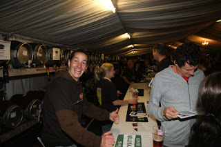
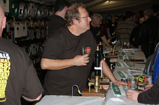
Plan: I planned to use the Didsbury beer festival to complete this exercise. It is a popular event with lots going on and is held in a big marquee. The extra challenges this raised were the shear number of people and the low lighting. I wanted a shot that captured the essence of the festival and the frenetic and continuous work of the volunteers behind the bar.
Results:
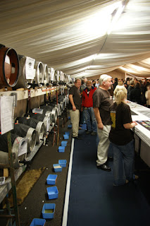
I started by scouting round the venue and taking shots from different angles and with and without flash. I then started zooming in from a prefered angle to get the shot I wanted.
I zoomed in further on the bar but could not get the shot I was looking for so I headed for a shot behind the bar....
I got some interesting shots level with the bar as I could capture the interactions between staff and customers.....
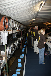
Looking down behind the bar wasn't what I was after until I moved further in....
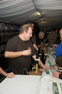
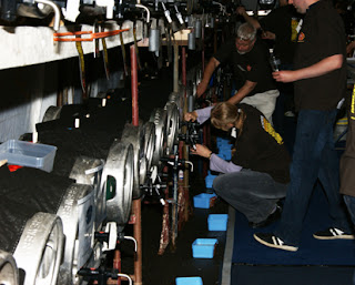
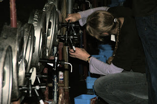
Moving futher in gave me a closer view of the staff at work....
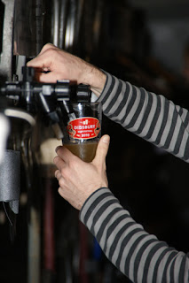
Zooming further still gave me the position I wanted but the action was fast and furious and there was plenty of opportunity to get it wrong as this shot shows
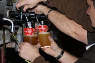
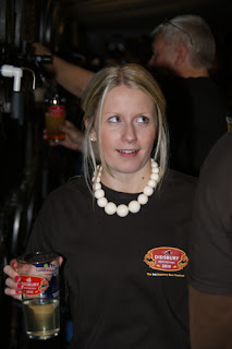
Finally I got a couple of shots I wanted giving a close up of the beer being poured. The first shot is more isolated but I like the fact that the second shot shows how busy it was. I also made sure I was at the left end of the bar as all the glasses have a measure on them with the logo to the left. This is why it is central on the images....not just luck.
I discarded a lot of pictures due to the fact that there was a lot going on with a lot of movement not just in my subject but in front and behind my subject making a lot of the images unusable even when I thought they were ok in the first instance. Even when you think you have the shot, take it again several times as close inspection may reveal otherwise.
If you can, scout the situation before deciding on the prefered angle or image and don't be afraid to keep shooting as this may reveal an image or angle you had not thought of.
.
Aim: The aim of this exercise is to examine the way we approach a subject and create the final image.
Plan: I planned to use the Didsbury beer festival to complete this exercise. It is a popular event with lots going on and is held in a big marquee. The extra challenges this raised were the shear number of people and the low lighting. I wanted a shot that captured the essence of the festival and the frenetic and continuous work of the volunteers behind the bar.
Results:
I started by scouting round the venue and taking shots from different angles and with and without flash. I then started zooming in from a prefered angle to get the shot I wanted.
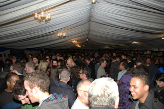 |
| F5, 1/60 sec with flash |
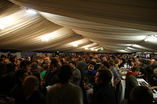 |
| F3.5, 1/6 sec |
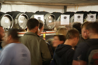 |
| F6.3, 0.8 sec |
 |
| F5.6, 1/60 sec with flash |
 |
| F4.5 1/60 sec with flash |
 |
| F5.6, 1/60 sec with flash |
Looking down behind the bar wasn't what I was after until I moved further in....
 |
| F5, 1/60 sec with flash |
 |
| F3.5, 1/5 sec |
Moving futher in gave me a closer view of the staff at work....
 |
| F11, 1/80 sec with Flash |
 |
| F11, 1/125 sec with flash |
 |
| F5.6, 1/125 sec with flash |
 |
| F6.3, 1/125 sec with flash |
I discarded a lot of pictures due to the fact that there was a lot going on with a lot of movement not just in my subject but in front and behind my subject making a lot of the images unusable even when I thought they were ok in the first instance. Even when you think you have the shot, take it again several times as close inspection may reveal otherwise.
If you can, scout the situation before deciding on the prefered angle or image and don't be afraid to keep shooting as this may reveal an image or angle you had not thought of.
.
Subscribe to:
Posts (Atom)


