Exercise: juxtaposition
Aim: The aim of this exercise is to put together two elements so as to suggest a relationship (juxtaposition). The options were to illustrate a book cover or photograph someone with a possession, or the results of their work or hobby. I chose the latter.
Approach and results: I tried a number of different ideas for this. I spent time at a stables where a friend of mine looks after the horses. I took a number of shots of her working but they were all a bit static and not overly interesting. Also horses are very dark when in the stables as the lighting is dim and they do what they fancy when they are outside (I'm not a big fan and wasn't getting that close) making the shot a bit hit and miss.
I changed tack and I finally settled on this image which is Ed working on an amplifier with the finished product in the foreground. This links what Ed does through the job he is photographed doing through to the finished product. Between Ed and the finished amplifiler is a checklist and pen suggesting an order of events. There are lines from the amp and the workspace leading into the frame pointing towards Ed.
Learning points:
I found it quite difficult to meet the brief and get an interesting picture. There need to be certain elements to make the picture work for the brief and certain elements that make the picture interesting. Making a more eye catching picture often resulted in losing the reason for taking it.
Exercise: Rain
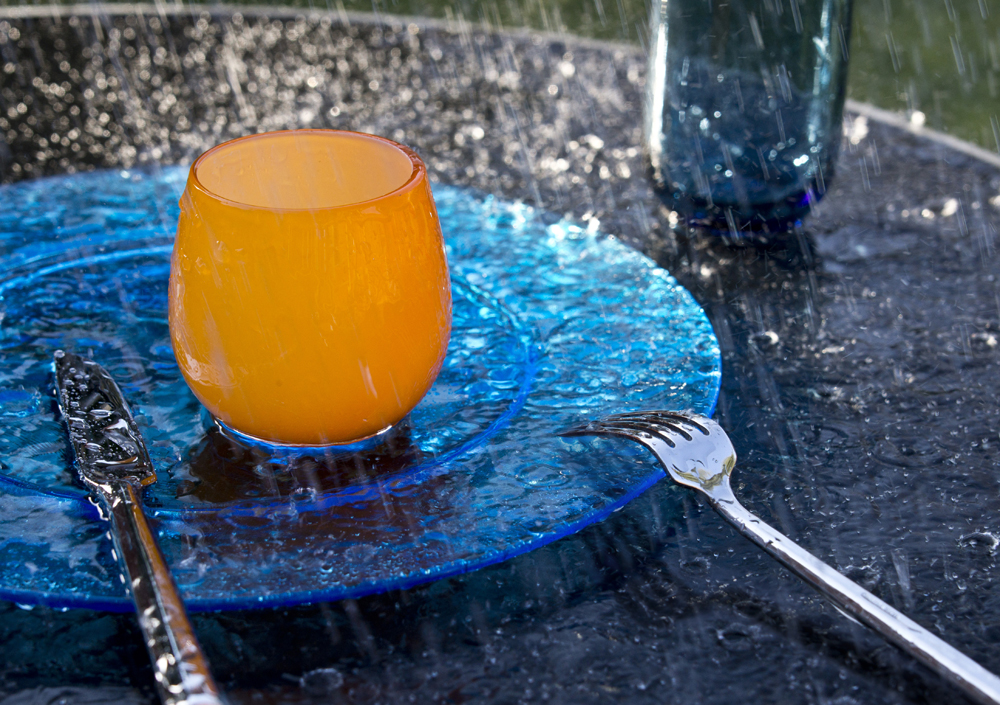
Aim: The aim of this exercise is to produce a magazine cover shot on the subject of rain.
Approach and results: As the course materials state, I didn't want to go for a rainy middle distance street shot as it lacks impact. I tried a number of shots in the rain with varying degrees of success, mostly taken in the back garden. These were close-ups of raindrops hanging on various objects; pine trees and a washing line. The washing line was a rotary line folded up with a cobweb on it which created quite a nice illustration of a long wet summer but it lacked any impact or vibrance.
I decided the way forward was to create my own rain. I chose to create a drowned place setting on a patio table. This was small enough to 'rain' on and still look authentic. Doing this in the back garden at -2c had its challenges. First off the hose pipe sprinkler head was frozen so I broke the ice on the watering can and used that instead. I used a dark glass table and I chose a glass plate and two glasses for the set-up, keeping the main colour blue with a corresponding orange accent. Funnily I've blogged before about my dislike of orange/blue combinations but I hold my hand up and say this worked well. To light the subject I used natural daylight (it was actually a bright sunny day) as I thought flash might make things a little too phony. I arrange the scene so the light came from the side, capturing the raindrops.
For the composition I chose a simple set-up with lines leading to the top left hand corner and the orange accent of centre and slightly raised. The fork leads the eye to the accent. I chose a depth of field that would drop the blue glass slightly out of focus to maintain interest on the orange glass. the inspiration came from Andre Kertesz 'The fork' 1928. That said, the composition could not be too contrived as I wanted it to represent someone being caught out by the weather. You can imagine someone dashing for cover as the heavens open.
I took the shot with a cable release in one hand and the watering can in the other, using 8 frames a second and waving the can around to ensure a good mix of pictures. The shutter speed was slow enough to create movement in the 'rain' (something that was missing from my earlier attempts).
However, as you can see from the split tone shot below, the fantastic reflections that were present in the set-up, disappeared when I started pouring the water; obvious really? This was a shame because the shadow and reflection of the fork travel through the glass plate and are particularly effective. I love this shot but there is no rain!!
Stop press!! It sudddenly dawned on me that I have the test picture 'sans rain'. All I needed to do was combine the two. First I cloned the fork shadow into the rain picture but this was too well defined even with the opacity down at 50%. For the final image I used a gausian blur on the test picture and then cloned the blurred shadow at 50% into the rain image below:
If you compare this image to the first rain picture you can see the subtle but important difference the shadow makes, returning a depth that had been lost.
Learning points:
With shoots that involve any kind of action it is important to run it through to get a clear idea of the result; the disappearing reflections being point of fact.
Even if a picture illustrates your point this does not make it interesting, dramatic or eye catching. My early attempts were perhaps more illustrative but were static and dull by comparison.
Exercise: symbols
Aim: The aim of this exercise is to find symbols for the following subjects and add short notes on how you would use them in a photograph. The symbols are growth, excess, crime, silence and poverty.
Growth: A seedling. Cupped hands full of earth with a seedling growing out of the earth. A simple, natural, face on portrait of someone with cupped hands against a white background.
Growth : A height chart or marks on a wall with dates by them. Two children, one taller than the other with the smaller one reaching up to the older ones height marks enviously.
Excess: Lots of the same objects. I would represent them stuffed in a suitcase so full it won't close. It couldn't be anything expensive, such as watches as this would just look like theft!.This also has connotations of excess baggage.
Excess: One of those excessively large and unnecessary 4x4s being filled up at a petrol station, preferably by a smaller person to help represent how unnecessary it is.
Crime: The classic white outline on a floor suggesting a victim of a crime with a reason or motive in the background to create a juxtaposition.
Crime: Bars on a window. This could be an individual window or a building with a line of barred windows or even a prison.
Crime: A homeless person outside a bank (corporate crime/crime against humanity). I would use a recognisable high street bank rather than say, the Bank of England. In the current climate bankers bonuses are still in the news and are becoming a byword for legalised crime!
Silence: A face with a zip for a mouth. This can be easily done in Photoshop or just by taping it in place. A finger to someones lips,
Silence: A shot of a space that is supposed to be quiet such as a library or monastery with people obviously not making noise.
Silence: The opposite to the above. A place that should be noisy but isn't; a football crowd that has just been relegated or is waiting for that vital penalty in the shoot out. Or an empty shopping mall that you would normally expect to be full, perhaps with a lone figure walking through such as a security guard.
Poverty: Homeless person - Here is a shot I took in Paris of a homeless person complete with crutches either side, beer cans, posessions hanging on the railings and.....mobile phone. I took it with the camera by my side so not to be noticed. The AF picked up the chain in front. Call it serendipity but it seems to highlight the trap that homeless people find themselves in, especially with the padlock hanging on the chain.
Poverty: A top down view of a weathered hand with a few pence in it. A simple shot, outdoors with nothing else in the frame. The juxtaposition of the weathered hand linked to the small change suggesting a life of poverty.