Friday 22 October 2010

The Frame: Project - Looking through the view finder

Exercise: Object in different positions in the frame

Aim:  The aim of this exercise is to explore the effect of putting the subject in different areas of the frame.

Plan:  Whilst doing the previous exercise I decided that I would find an object in Lyme Park that I could isolate against the background.  I had no strict idea of the subject but I wanted a series of shots that did not include an horizon.  I spotted a plant growing out of a wall and took a couple of test shots to make sure it was suitable.

Results:


The following shots are show examples in order of preference from best to worst.  All shots were tripod mounted and an aperture stopped down slightly to 7.1 to ensure focus across the frame.


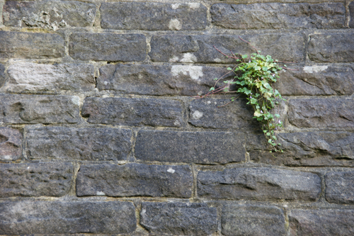
The most pleasing image is with the subject in the upper left of the frame.  Because, in this case, the plant is growing down and slightly to the right, it leads into the image from this position.  Also, not being central brings the background into play as part of the image rather than something that happened to be behind the plant.  The other off centre images work to lesser degrees.

The central subject, despite capturing the subject clearly, looks like attention was paid to the subject alone without any interest in the background.  This image would have worked better if the background were thrown out of focus (not possible with this subject).  The background has to play a part.

The last image with the subject on the far right does not work.  The subject is too far to the edge of the frame suggesting that the subject was almost missed.   


Wednesday 20 October 2010

The Frame: Project - Looking through the viewfinder

Exercise: Fitting the frame to the subject.

Aim: The aim of this exercise is to explore the size of a subject within the frame.

Plan:  I planned to use the 'Cage' in Lyme Park (originally built as a hunting lodge) as my subject.  I chose this subject as I could get close up and also view it from a distance from a number of directions.  The weather was mixed and got progressively worse. 

Results:

F9.0, 1/250sec, 130mm
Shot 1 - This first shot has been taken with no attention to the position or size of the subject in the frame (deliberately).  The result is a bland uninteresting shot.  The sunlight on the foreground only aids in making the main subject less significant.The centrally placed folly and central horizon do not provide any lead into the shot or any sense of drama for what is actually a dramatic scene.  The people by the folly help give a sense of scale but the people nearer the camera only add as a distraction.


F9.0, 1/80sec, 28mm
Shot 2 - This shot is a tight crop on the folly and has also had some lens correction applied using Photoshop to correct the converging verticals.  I did this to get a tighter crop at the top of the frame due to the size of the subject.  The resulting image provides no context for the environment.  The close cropping does not provide a suitable frame for the shot and would be better cropped that bit further so that the edge of the folly is not visible.  This is not always the case when cropping tightly but in this instance the cropping does not add anything.

Shots 3,4,5 - The following 3 shots are all parts of the subject.  At this point the interest becomes the detail of the subject, the brickwork lines and shadows.  They become the subject rather than the building.  There are hints to the age and scale of the subject but not the location or context.  The viewer has the opportunity to use their own imagination for the overall scale and setting.  All three shots would benefit from stronger lighting to accentuate the lines in the brickwork.

F8.0, 1/80sec, 75mm

F9.0, 1/60sec, 26mm

F9.0, 1/60sec, 50mm

 Shot 6 - This shot was taken to stress the surroundings.  It shows the isolation of the subject in it's environment.  Like image (1) the people help to give a sense of scale.  Interestingly, if taken from another angle I could have shown Manchester in the background showing the folly's proximity to the urban environment and changing the context of the picture entirely.

The image would benefit from some foreground interest leading the eye into the picture.  The lighting is better in this shot, with the brightly lit hills in the background rather than the bright foreground of image 1.  However, light falling on the subject would have improved the shot, especially against the dark sky.

F13.0, 1/80sec, 100mm
The following 3 images are different crops of the first image.  All of these images offer a different viewpoint.  My preference is for the 'landscape' or 'widescreen' shot as this accentuates how isolated the folly is. 


Learning points:

I was surprised that the tight crop did not work in the way I thought.  I expected a greater sense of drama having used this technique before to good effect.
Close cropping on part of a subject changes the subject completely.  In this case from looking at an isolated folly to looking at patterns and shapes within it.
Placing the subject within it's surroundings changes the view again.  Not just the fixed physical landscape but also the changing aspects (people in this instance).
All of this is in the control of the photographer and needs to be considered in creating the image.

Sunday 10 October 2010

Bardot, Bond, Beckham and Beyond: Photographs by Terry ONeill

Whilst completing an exercise for 'The art of photography' on Saturday, I went into the Richard Goodall gallery in Manchester to view this exhibition.  If you're in the area it is well worth visiting.  Terry O'Neill has been taking celebrity photos for many decades and there are some great images.  O'Neill is renowned for capturing people in a sympathetic way, bourne out by the images on display.


My favourite?  There is a David Bowie Diamond Dogs contact sheet from 1975.  Apparently Bowie was stoned at the time which is clear from the series of pictures.  I like the contact sheet because it gives an idea of how difficult it was to get the shot right especially with a big lively dog.  You can also see the way the shot was set up as the images are not cropped like the final print.  You can see the toy/treat that has been dangled to make the dog jump and the simple construction of the set.  It also shows that you don't get it right every time and that the final image takes effort.  If I had the money a copy would be on my wall now.

http://www.richardgoodallgallery.com/contemporaryart/bardot-bond-beckham-and-beyond-photographs-by-terry-oneill-news-73.html

A way of seeing: Project - photographing movement

Exercise: Panning with different shutter speeds.

Aim:  The aim of this exercise was to compare the results of panning with a moving subject using different shutter speeds.

Plan:  The plan was to take my partner's two nieces to the park and photograph them on a zip wire which would have a fairly constant speed as it mainly uses gravity.  What actually happened was a minor accident resulting in two nieces unhappy with going on the zip wire and Katya (my partner) acting as the replacement.  There are only 7 shots as there is only so long an adult can hog a zip wire in a busy childrens' playground with a queue of kids and parents waiting (sorry)!

Results:

The results range from 1/5th sec to 1/125 sec.  Although there are only 7 shots, they cover a good range of movement.  A lot depends on the panning action as the slowest shutter speed is, in fact one of the clearest.  The shots at 1/6th and 1/10th have not frozen the subject which is down to my panning.  1/20th and faster became much more manageable but much less animated.  1/40th and upwards did not provide enough of a sense of movement and are uninspiring as a result.


The shot at 1/20th is the best for a number of reasons.  The subject is sharp and the background is blurred but not overly.  Also Katya's position, angled slightly more towards the camera adds to the shot and finally she is smiling which, in this case, adds to the sense of fun and compliments the sense of speed and the thrill of the zip wire.


F8 1/20th sec

The shot at 1/5th shows is an interesting result.  There is a much greater sense of speed which is more appealling.  However, I know that Katya wasn't going that fast; but does that matter?  I don't think so in this case.  It looks more exciting.  Another issue is that movement has only been frozen around Katya's head whilst every other part of her shows some blurring.  This adds to the picture showing that it is important to keep the main features sharp but not necessarily the rest.  I'm not sure how it happened, I'm assuming that Katya's head was moving along the same plain as the camera whilst the rest of her wasn't.  The image seems to pivot round the head?  In some ways I prefer it but it's not as much fun as the shot at 1/20th.


F11 1/5th sec
 Learning points:
  • Panning takes practice and the same shot in the same conditions can be sharp or blurred depending on your panning action.  I would still persevere with a slower shutter speed and keep taking the shot until it was right (if possible).
  • Single elements are important but it has taken a number of elements combined to make a good picture in ths instance. This may not always be the case if a single element is that dominant, but I think it is here.  In this case it's a combination of panning, shutter speed and expression that produced the best image.
  • Turn the image stabilisation off you fool!
  • Never work with children or animals.

A way of seeing: Project - photographing movement

Exercise: Shutter speeds

Aim:  The aim of this exercise was to capture movement from a fixed position using a range of different shutter speeds.

Results:  My first choice for this exercise was a section of dual carriageway near to where I live.  This didn't work very well.  Even though I could complete the exercise, the images were dull and boring and also dependant on the varying speed of the traffic.  So I moved on to the big wheel in the centre of Manchester.  This had a fixed speed and was a much more interesting subject.  I also chose it because I have photographed various wheels before and it is easy to make them look unrealistically fast.

The problem with shooting the wheel was that it was a bright day and I needed to use long shutter speeds.  As I was inevitably going to end up shooting up at the wheel I tried to cut out most of the sky by using a building in the background.  The glass front also added some interest as it reflected the wheel.  I also used an ND filter and ISO 100 to slow the camera down.  I walked round the wheel for a while looking at different angles before settling on the final position.

The following 12 images show a gradual shortening of the shutter speed from 1.7 seconds through to 1/30th of a second.


The movement is frozen at the shortest exposure (1/30th sec) but this is not the best picture. 

1/30 sec F5.6

The longest exposure gives a sense of movement but this is too much and gives the impression that the wheel is moving unaturally fast.

1.7 secs F25

The 'best' (most representative) image is 1/6 sec, giving the closest impression of the speed of the wheel.
1/6 sec F13

Learning points:

The right shutter speed needs to be selected to re-create movement that is representative of the subject.  If you had never seen a wheel like the one in this exercise then the image at 1/6th sec would give you the best impression of the real movement.  Alternatively you can give a deliberately artificial impression, if this is the result you are looking for, by using a longer or shorter shutter speed.  The phrase 'the camera never lies' springs to mind.  The camera does allow you to present a completely different view of an identical scene.

Test the extremes at the start of the exercise so you know it will work!

Friday 1 October 2010

A way of seeing: Project - Focus

Exercise: Focus at different apertures:

The aim of this exercise is to explore the relationship between aperture and focus, or depth of field.

Plan:  The previous exercise was indoors with vodka minatures.  As I would be stopping the lens down in this exercise I decided that outside would be best otherwise I would need quite long exposures or a flash.  Using flash would set a continuous speed and therefore would not demonstrate the relationship between speed and aperture.

Results and reality:  My first set of images were of some railings on a bridge but the difference in the images was not that great; visible on inspection but not obvious when small and posted on a blog.  I don't have a fast lens (yet) so the best way to create the desired effect was to use the zoom from a distance with a max aperture of F6.3.  I then went into the garden and put some pegs on the washing line at regular intervals and kept them the same colour to avoid distraction.

 F6.3 1/125sec


F14 1/25sec

F40 1/3sec

The red lines show the areas in each picture that have remained in focus, increasing as the aperture gets smaller.

Learning points:

Think how the images are to be used - my initial set were fine when viewed full size on a 24" monitor but not great on a blog.

With a combination of focal length and aperture you can isolate or accentuate any part of an image to attract the viewer's eye.  Importantly you are actually isolating a plain.  Looking at the results, the red lines show areas at the bottom right that are in focus so I have not just isolated the pegs but also areas of the washing line that are on the same plain, which was not the desired result.

A way of seeing: Project - Focus

Exercise - Focus with a set aperture

The aim is to consider the effect of focusing on different parts of the same scene.
Plan: I am planning to set up a line of Russian dolls at an acute angle for this exercise.  I will take a series of shots focusing further and further down the line.

Results and reality:

The Russian dolls have turned into Swedish vodka (minatures - honest)!  I decided that keeping the objects the same size would allow me to concentrate on the task at hand rather than worrying about perspective.  For these shots I created a mini studio using a white board and some white card.  All shots were taken at 80mm, F5.6, 1/60sec and ISO200 with the camera mounted on a tripod.

Focus on the middle bottle:


Focus on the far bottle:


Focus on the front bottle:


Learning points: 

I prefer the image with the focus on the front bottle.  The sharp front object catches the eye and draws you into the picture.  It looks deliberate and gives the image a sense of purpose that the others don't have.  That said, my second choice is the image with the focus at the back as this also looks deliberate and retains some sense of purpose whereas the middle focus doesn't catch the eye at all.  Having sharp focus on a small area directs your interest; if all the bottles were in focus I think the image would less interesting still.

I think in general it is the main focal point of the image that needs to be sharp and not necessarily the object at the forefront.  I have taken similar landscape shots where the foreground is in focus and the landscape is thrown out of focus and vice versa.  Both images appeal but for different reasons.  I'll post them when I find them!

A way of seeing: Project - Getting to know your camera

Exercise - Focal length and angle of view:

The aim of this exercise is to explore focal lengths and find the 'standard' focal length for your camera.

The plan: I'm aiming to use the back garden as I can pick a spot that I can easily return to again and again.  I'll use my zoom (18-250mm) and expect the 'standard' to be around 75mm.  As I use an APS-C DSLR, there is a 'magnification' factor of 1.5.  This doesn't actually magnify but crops the field of view, giving the impression of magnification but means the A4 prints produced will have a magnified effect.

Results:

'wide angle' 18mm, F/6.3, 1/60sec, ISO200


'standard' 70mm, F/5, 1/125sec, ISO200


'zoom' 250mm, F/6.3, 1/160sec, ISO200

Holding the A4 print at a distance where it is the same size as the scene gave the following results:
18mm - 18cm approx
70mm - 80cm approx
250mm - 260cm approx

Learning points:

Despite the margins for error the distance in 'cm' that an A4 print is held at to match the scene is remarkably similar to the focal length in 'mm' that the picture was taken at!  Not a result I anticipated.

The 'standard' focal length is a much more comfortable viewing distance.