Mitch Epstein: American Power (2003-9) examines how energy is produced and used in the American landscape, exploring the effects of mass consumption and the interaction of nature, government and corporations.
There were eight photos from the American Power series on display at the gallery which may not sound much but they were approximately 4x4.5 feet and extremely detailed. Some of the pictures were difficult to view because of reflections due to their location in the gallery. One part of the gallery had a high ceiling which provided a better lighting angle. Galleries with low ceilings tend to have the lights reflecting in the photos.
Biloxi, Mississippi (2005) shows the result of hurricane Katrina. Cars overturned and matresses in trees showing the ultimate power of nature that cannot be stopped or reasoned with. Martha Murphy and Charlie Christian, Mississippi (2005) also shows outcomes from hurricane Katrina with the two people sitting behind remaining posessions. This picture also brings in to play the power of religion and government symballised by the clear dog tag and cross round the necks of the main charachters.
 |
| Martha Murphy and Charlie Christian, Mississippi (2005) |
The same 'ultimate power' also exists on other levels; the ultimate power of corporate vs the individual. If you take Poca high school and Amos coal power plant, West Virginia (2004) you see the town in the shadow of the huge coal power plant, literally in peoples' back gardens. Epstein discovered this corporate power to his cost on a number of occasions when being moved on by police with the excuse that the power company didn't allow pictures, enforcing corporate law rather than constitutional.
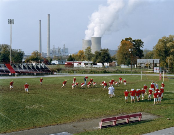 |
| Poca high school and Amos coal power plant, West Virginia (2004) |
BP Carson refinery, California (2007) pictures the refinery with a US flag draped over one side pointing to the link between oil and politics and the power struggle that goes with it. Interestingly the power of nature is still underlying in the form of the line of trees bent by the wind reminding us that it has ultimate power.
 |
| BP Carson refinery, California (2007) |
I found this picture of Margaret Thatcher rather disturbing. Over time Thatcher has become a characature in my mind (helped in no small part by Spitting Image). The white face and large mouth in this shot remind me of Jack Nicholson when he played the Joker in the first Batman film!

The pleasure principle is the psychoanalytic concept describing people seeking pleasure and avoiding suffering (pain) in order to satisfy their biological and psychological needs. It is also the title of a Gary Newman album who is synonymous with the 80s (the album was in fact released in 1979). Steele-Perkins has caught the element of having a good time (the pleasure principle) but has done so with a certain unsavory tackiness about it. That said, there is more humour than, say, Martin Parr for example. The best example of this is probably Blackpool beach; a place that is always going to provide a rich vein of opportunity.

I warmed to the Steele-Perkins images the more time I spent looking at them. Time that was necessary after looking at Epstein's large and beautifully produced prints.


