Aim: This exercise is in two parts. Firstly three images expressing the primary colours with their complementary secondary colours using the specific ratios suggested by Von Goethe and secondly three images of alternative colour combinations that appeal with an explanation of why.
Approach and results:
I found that my attraction to colour was not always down to the colour itself. In previous ‘points’ exercises it has been necessary to view the shots in black and white to ensure that the colour was not influencing the points in the frame. I found the reverse in this exercise; I had to dismiss the object and think about the colour. So a blossom tree that looked spectacular because of it's scale was not necessarily a good subject when you just think about the colour.
Red:Green - ratio 1:1. This shot was side lit to avoid any shadows and to keep the red background from reflecting the flash. The red has varying tones that follow the same lines as the leaf. The green has the greatest tonal range giving the leaf more depth and making it stand out more. The ratio of 1:1 only works if the colours are of the same brightness but also the subject influences how the eye sees the picture. In this picture the red is the background and not a specific object vying for dominance with the leaf.


Orange:Blue - ratio 1:2. This shot was taken early afternoon when the light was fairly neutral. I would normally have taken the roof line further up to the corner but this would have changed the colour ratios giving me too much blue. I like the bold blocks of colour and simple lines. Again there is a range of tones from the softer blue sky through to the deep blue of the shadows on the wall and the more vivid orange of the door.

Yellow:Violet - ratio 1:3. Finding violet and yellow was quite a difficult task. It is not a popular combination in the urban environment. I created this shot by picking the yellow flower and placing it in the shot whilst trying to keep it looking natural. I feel that nature makes a better job of violet and yellow combinations that don't appear as pleasing or complimentary in the urban environment.

Green:Orange - ratio 4:1. These colours are offset on the colour wheel and are therefore not obviously complimentary. The orange is brighter and stronger than the green and provides a series of points of interest, drawing the attention of the eye. It is definately the colour that makes this image. If you picture it in black and white it becomes a collection of flowers and leaves that makes the viewer wonder why the shot was taken.

Red:Orange - ratio 5:1. There are many shades of red in this image so judging the ratio is not so easy. These colours are next to each other on the colour wheel and both on the 'warm' side. This creates a rich, warm, almost glowing image.

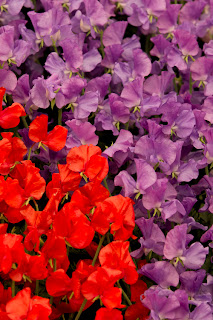
Violet:Red - 2:1. These colours are next to each other on the colour wheel but fall on different sides, warm (red) and cool (violet). The red is bright and vibrant so I chose to make it smaller. The violet would have been overpowered and insignificant otherwise. The overall result is still a warm image as the firey red is enhanced by the rich violet.
Learning points: I find the 'supposed' complimentary colour combinations less interesting or appealing than those that create a warm or cool image. I also prefer the offset combinations that create tension in an image.

Red:Orange - ratio 5:1. There are many shades of red in this image so judging the ratio is not so easy. These colours are next to each other on the colour wheel and both on the 'warm' side. This creates a rich, warm, almost glowing image.

Violet:Red - 2:1. These colours are next to each other on the colour wheel but fall on different sides, warm (red) and cool (violet). The red is bright and vibrant so I chose to make it smaller. The violet would have been overpowered and insignificant otherwise. The overall result is still a warm image as the firey red is enhanced by the rich violet.

Learning points: I find the 'supposed' complimentary colour combinations less interesting or appealing than those that create a warm or cool image. I also prefer the offset combinations that create tension in an image.
It is important to take into account the significance of the subject when identifying colour; is it the colour or the subject that attracts? I was completing this exercise whilst blossom trees were out but if the same colours were shown to me in say a handful of sweets would I be drawn to them in the same way? – I doubt it!
The ratios are a guideline and only work for the average brightness. A very dark green against a bright red would not warrant a 1:1 ratio.
The colour reproduction on the blog is, as ever, not faithful.
The ratios are a guideline and only work for the average brightness. A very dark green against a bright red would not warrant a 1:1 ratio.
The colour reproduction on the blog is, as ever, not faithful.
No comments:
Post a Comment